

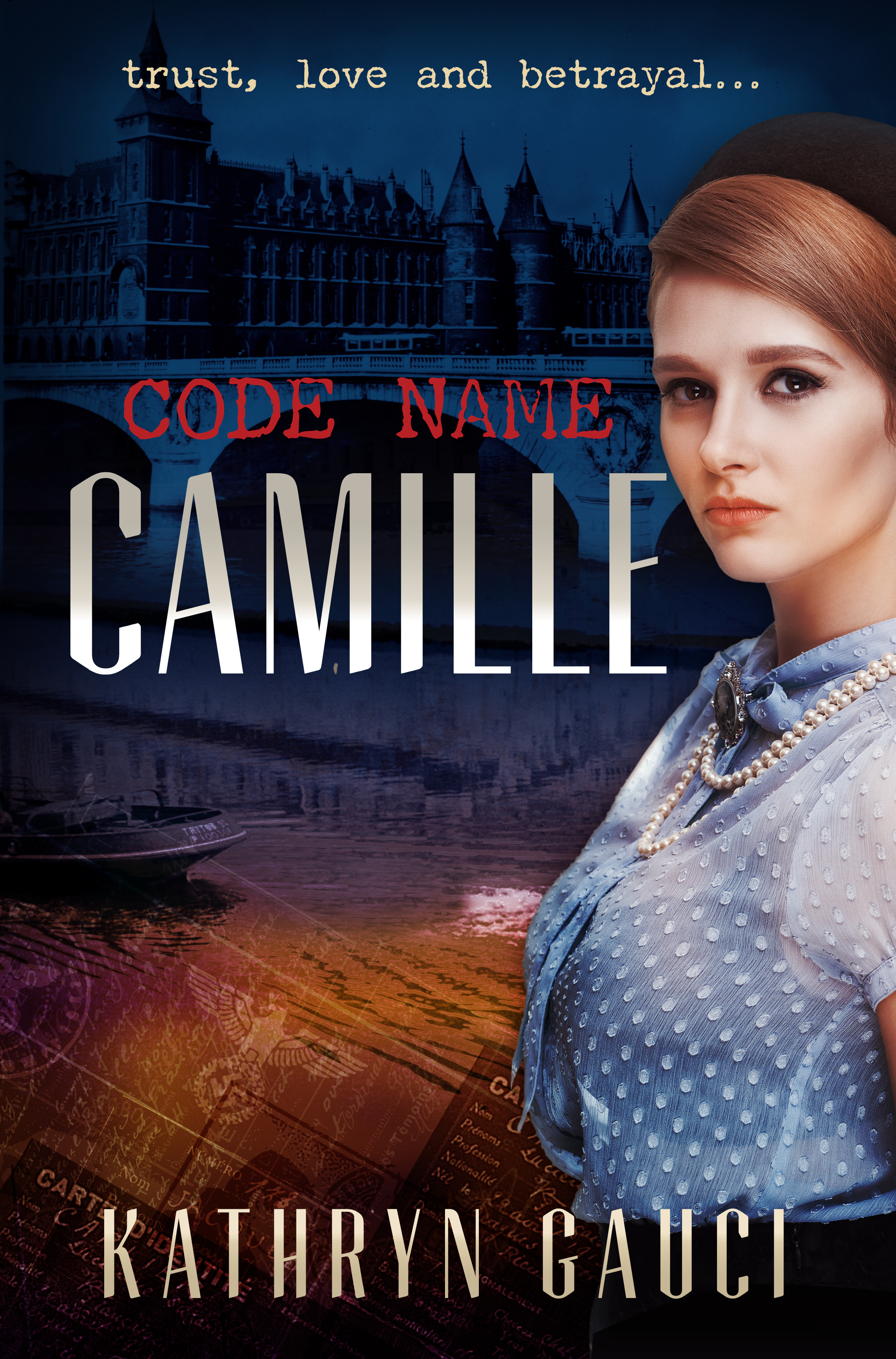
Kathryn Gauci writes with insight and sensitivity about the difficult and intertwined histories of Greece and Turkey, and also about the great drama of the Second World War. Her characters are caught up in the flow of events, and often forced to deal with great tragedies and make impossible choices. The Carpet Weaver of Usak depicts Greeks living alongside Turks in Asia Minor, a circumstance almost unimaginable today. Typefaces used: Orpheus Pro and Playfair italic. Code Name Camille explores the world of the Resistance in France, and the attendant dangers and betrayals.

Epic Fiction and Domestic Dramas — Book Cover Design

Thomas and Rose spans the globe and many decades, while Memoirs of a Stay at Home Dad charts the efforts of one dad to raise his children and deal with the changing roles of men. The Thomas and Rose cover uses the sharply cut and elegant Orpheus Pro for the title, and the Stay at Home Dad sports the rough and warm finesse of Five Boroughs.

Creative Mornings Melbourne

Serial founder of interesting design-based companies (Swiss Miss, to-do app Teux Deux, and Tattly, Tina Roth Eisenberg is also behind the global design talks known as Creative Mornings.
Melbourne has its own series, so if you're interested in designers talking about designy things (there's a different theme every month), then consider going along. At the price of free, how could you miss it? In a section impishly titled "convince your boss", the organisers advance the following argument:
“From design legends to hometown heroes, CreativeMornings speakers are selected by each chapter based on a global theme. Past speakers include visionaries such as Seth Godin, Ben Chestnut, Jessica Hische, Debbie Millman, Simon Sinek and David Kelley, among many others. These accomplished individuals share their stories and lessons they’ve learned throughout their careers and in doing so, pass on invaluable knowledge to the audience. I will walk away from the event feeling motivated and inspired to apply those lessons to my own work. ”
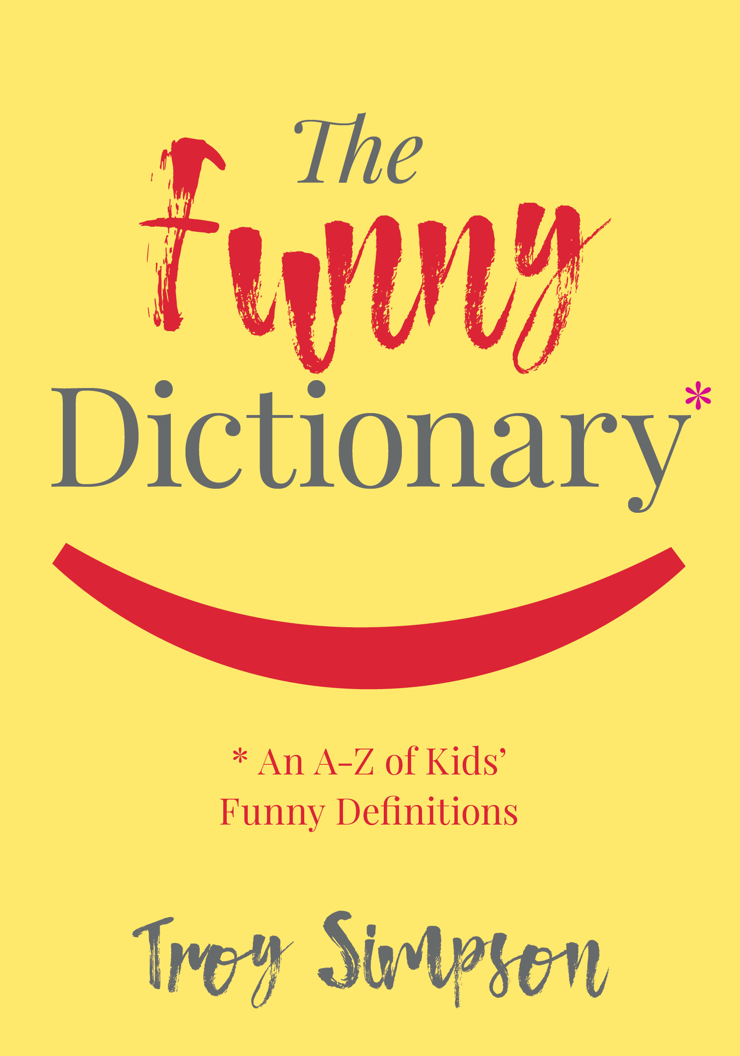
Funny Mistakes — Book Cover
The Funny Dictionary (published by the National Library of Australia) makes gentle sport of inadvertently amusing definitions written by children. Some of the "howlers" are accompanied by thematically aligned images from the extensive National Library photographic archives. The cover below was selected from many options generated by Working Type Design. The book is due for publication in the first half of 2018.
Waterfalls of Type Colour
Made possible by recent innovations in type software, live chromatic type is creating a bit of a furore in type design. Here's an interview with one of the field's passionate proponents. Of course, Chromatic typefaces are not new -- the spectacular original versions were cast in metal and set by hand.

Chromatic typeface specimens from the 19th Century
It's a Gas Gas Gas

Natural Gas Volume 03
Cover design for Volume 3 in a projected 4 volume series on natural gas. Bright primary colours, bold simple typography and industry-related images.
A Designer's Mantra

The great German designer Erik Spiekermann sometimes hand-prints a series of letterprint posters. The typically clean and pithy example above could be the prayer of all designers for fair recompense, particularly in the era of Fiverr and Ninety Nine Designs.
Classical Poetry — Book Cover Design
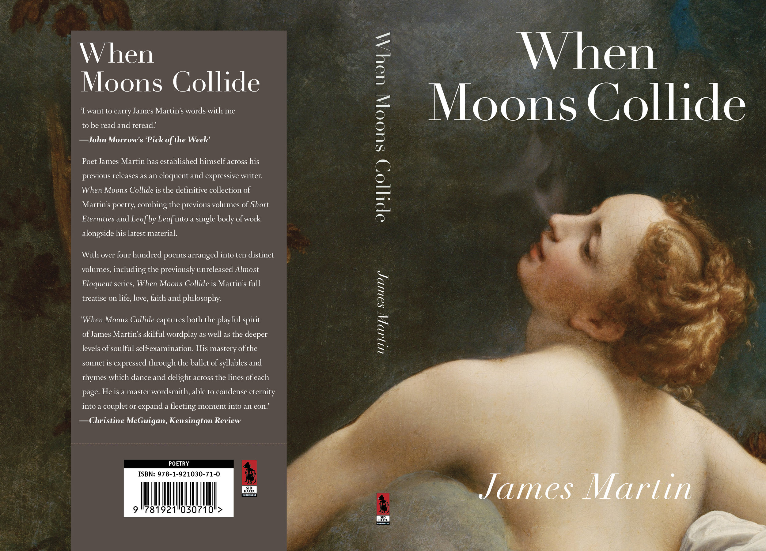
James Martin writes expressive classical poetry about the human condition. His latest book contains 400 poems dealing with life, love, faith and philosophy. Corregio's Jupiter and Io seemed perfect as the cover for this volume. The title typeface is Linotype Didot.
Typography and Elephants
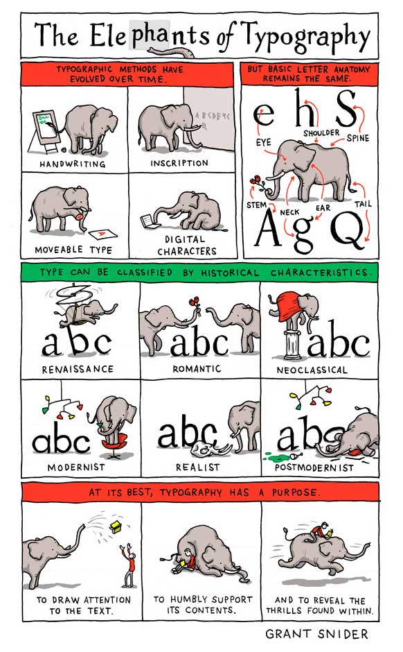
A charming look at the architecture of typefaces, and a useful mnemonic for remembering the terms used for their constituent parts. Posters available from the author's website.
The Silver is Mine — WorkingType Cover
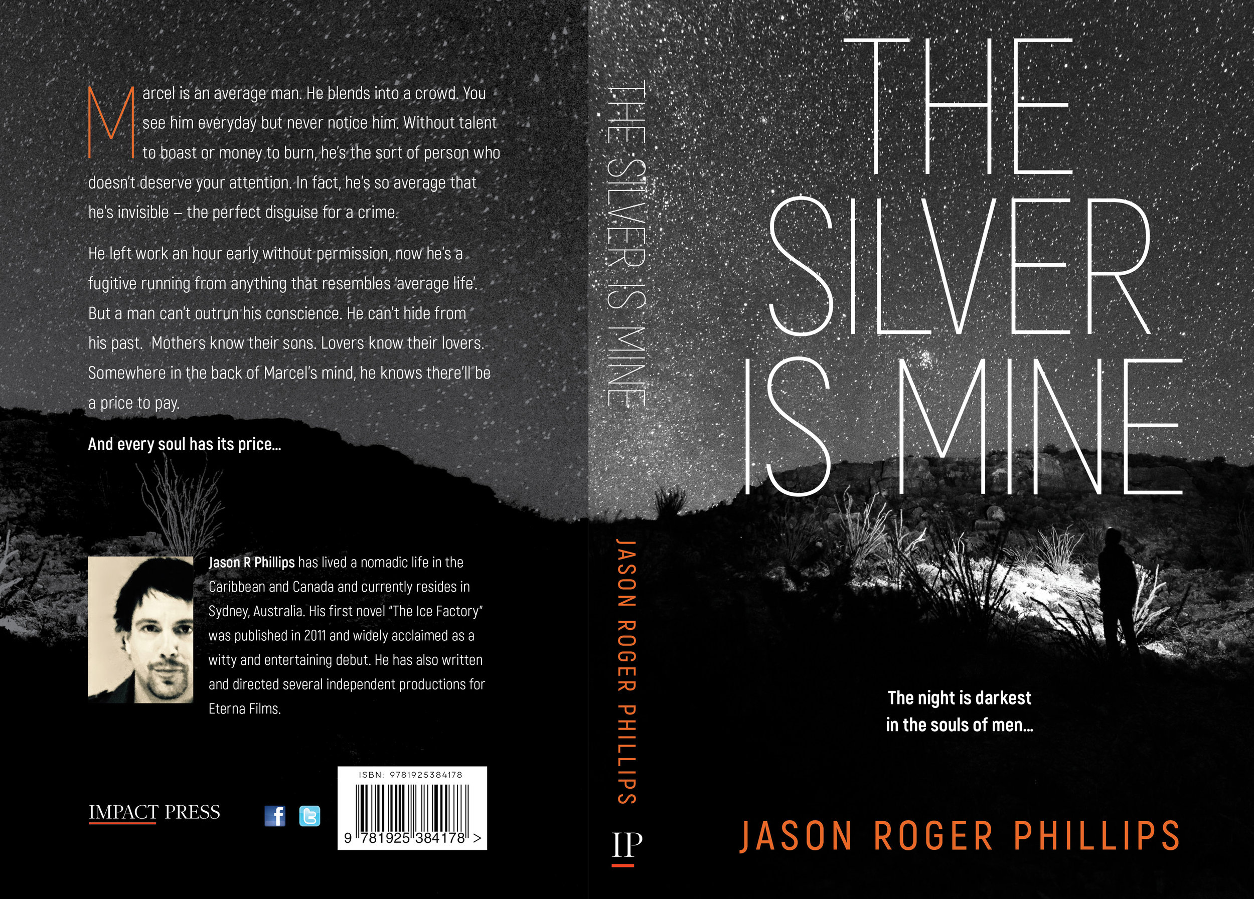
The Silver is Mine is an edgy psychological thriller published by Impact Press. Our client wanted a stark and high-contrast design. We used Akrobat Sans for the title type and a monochromatic starscape with enigmatic figure. The author's name provided the only splash of colour.
Faraway Places — Book Cover

In "Faraway Places", Albert Trajtsman writes about strange places and abominable acts. One of the tales dealt with an outpost the wilds of Tsarist Russia, and led us to use the photograph of Siberian windmills in the background, paired with monstrous images from medieval documents.
Miles and Miles of Type
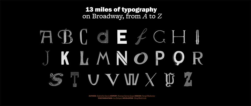
It would be difficult to top this website for lovers of street typography — a survey of 13 miles of one of the world's best known avenues. A great showcase of the glorious variety of public taste when it comes to type.
Why Type Selection Matters (or How Not to Give People a Reason to Stop Reading)
Matthew Butterick at Practical Typography makes a great argument for considered type selection and use. A great line from the essay:
“The substance matters, but if that’s all that mattered, then everything could be set in 12-point Times New Roman. And that would be the equivalent of mumbling toward your shoes.”
Using Type Effectively on the Web

Type guidance for web neophytes.
Read moreA Deadly Institution — Book Cover Design
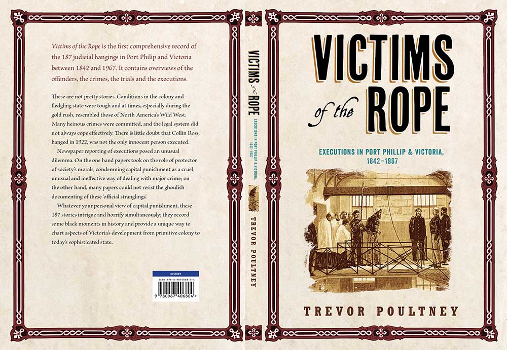
Victims of the Rope, by Trevor Poultney
A cover design for a book discussing judicial executions in Victoria, Australia.
Read moreType Lovers United

The creator of this website doesn't post often, but when he does, he makes up for the lack of quantity with sheer quality. He has an eye for interesting new type design plus a deep knowledge of design history. His enthusiasm is infectious. Well worth visiting for ideas and inspiration, unexpected combinations of type and strange tales from the dawn of typography.
Re-starting an Important Social Debate
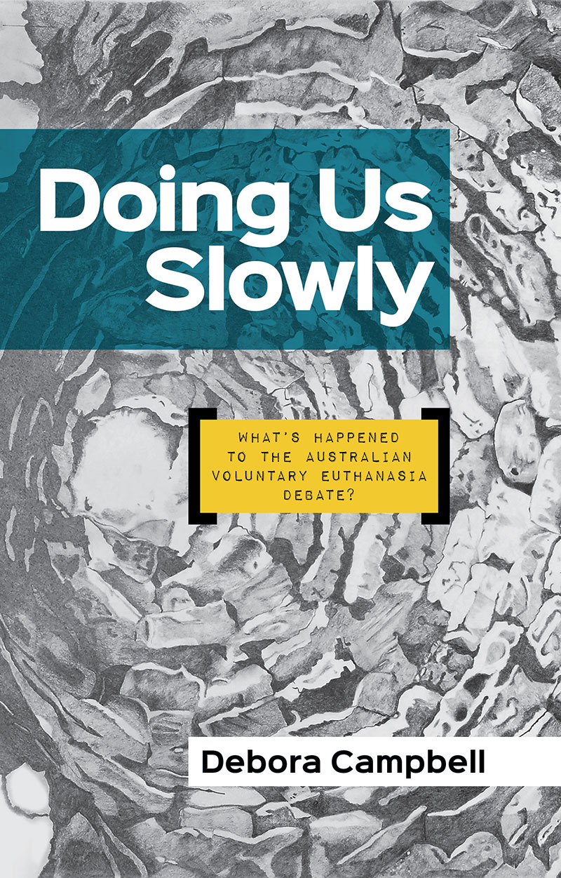
Deb Campbell is a passionate advocate for voluntary euthanasia. She believes that risk averse politicians have quietly kept the issue out of the public debate, despite broad public support for greater patient control over the end of one's life. We used a bold, highly visible sans typeface with a touch of personality for the title and author name (Sinkin Sans) and used Impact Label Reversed for the subtitle. The delicately shaded background artwork was supplied by the author.
Bayside Grunge — Book Cover Design

A tale of growing up on the shores of Port Phillip in the 1980s, featuring a lad with attitude, problems with the authorities, and a taste for booze. Out soon from Brolga Publishing.
Font Use Across the Internet

Despite the advent of web-served type, Arial is still Queen of the Internet. 616,000 of the Web's top million websites use this rather unexceptional typeface. Fontreach gives an useful snapshot of font use.There are several old standards originally commissioned by Microsoft, a few freebies served by Google and finally, further down the list, some interesting new typeface designs.
Everything, All at Once — A Timeline of Our Planet
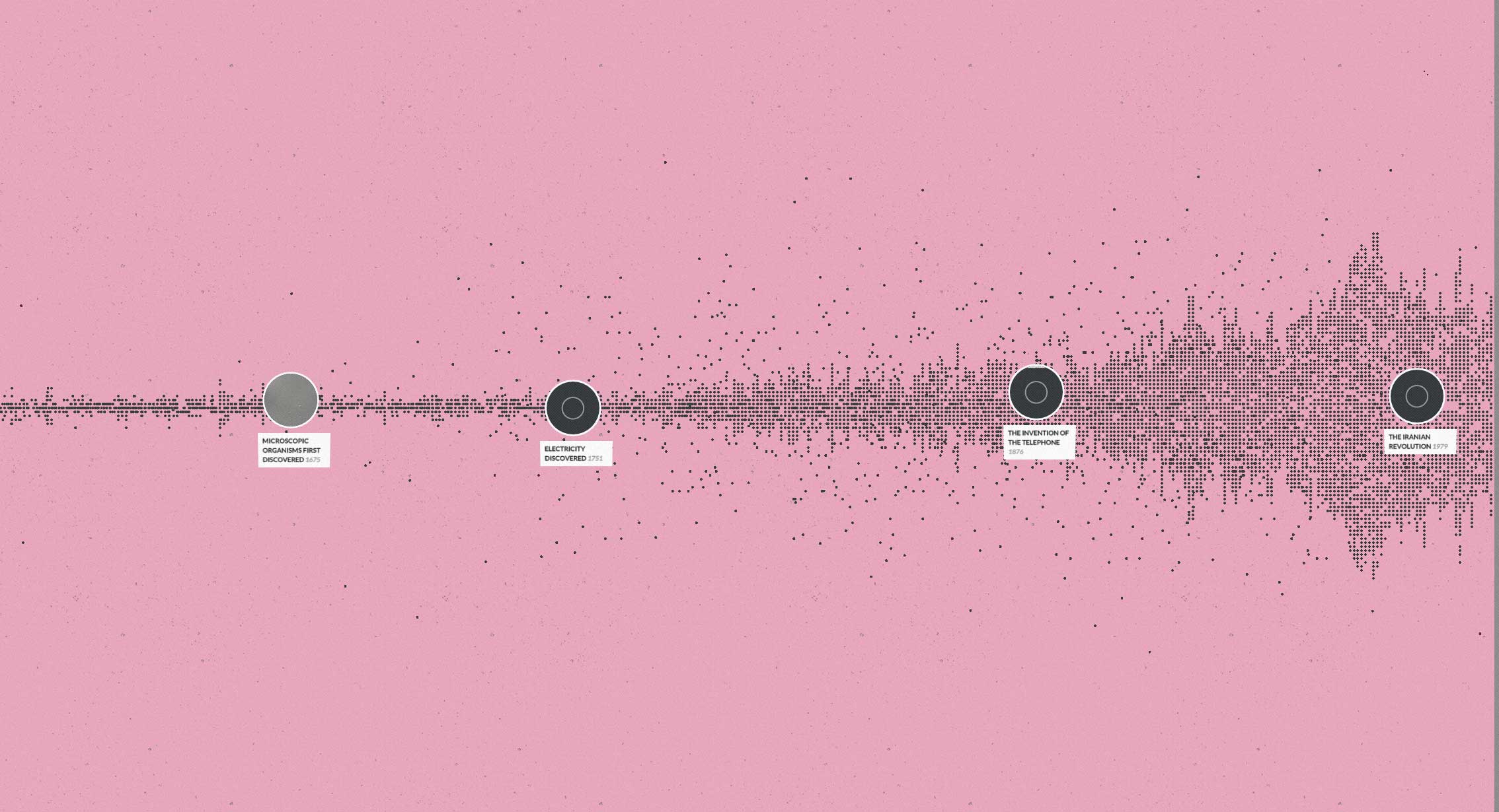
This fascinating and graphically striking website maps historical articles on Wikipedia onto a timeline. Viewers can confine themselves to the tiny span of Earth's history that features the human race, or zoom out to the unimaginable expanses of geological time. Incredibly, the project was put together by (very smart) college students.
“The viewer can choose to watch a variety of events which have happened in a particular period or to target a specific event in time. For example you can look at the past century within the categories of war and inventions.”