

Book design is usually characterised by an extreme diversity of subject matter, and this batch of recent designs is no exception to that general rule…[


Advice to Myself That I do not Necessarily Take
An acquaintance recently asked me to write some advice for her just-staring-out graphic designer daughter. This was my take, and I am not sure how good it is, or if I missed something important.
Make sure you put aside at least one quarter to one third of incoming payments to cover future tax / GST obligations. Super important to do this from the beginning, or you will be forever in the stressful position of playing catch-up.
Consider operating as a company – there are some tax advantages to this, but also more paperwork and accounting expenses. And you will have to pay the state workplace insurance fee each year, which has jumped to almost 1K per year.
Referrals are very, very useful, and they keep working for years. The bigger your network of contacts, the more chances that new jobs keep coming up. A client is much more likely to accept a quote from a business to whom they have been referred. You are in a sense a known quantity to them
Every author is a potential source of future work. It may be years in the future, but an author often writes a second or third title – if they had a good experience with you, they will come back. I have found it good practice to keep in touch with them by emailing newsletters with useful information for authors, new tools, author news etc.
Keep every testimonial / positive review you receive. Post them to your website, and ask satisfied customers to leave reviews on your google profile
Consider joining the Australian Book Designers Association or the Small Press Network
Make sure you refer your clients to other trusted suppliers – in your case, to printers, editors, proofreaders, illustrators, photographers etc. They will often repay your referrals in kind and if your clients have a good experience with one of your referrals, your status as a trusted provider will be enhanced. I have heard this referred to as the ‘honest broker’ role, and it is definitely worth aspiring to
Consider finding a compatible business partner or partners. Being a sole practitioner has its benefits, but also costs – difficult to have down time, difficult to grow past a certain point, becoming stuck in the same role, potentially unable to take on very large jobs or multiple large projects. Perhaps your business partner might specialise in web design, or assisting authors online or some other complementary service. There are services like Fiverr that connect you with typesetters, people who run amazon ads, ebook conversion etc, but I have always preferred to work directly with suppliers rather than through a third party. That said, I have found fiverr very useful for performing one off specialist tasks – creating a 3D rendered object, or a bit of specialist accounting
Consider offering a package service – authors or publishers often have several requirements and it is a ‘pain point’ for them to have to juggle multiple contractors to do them – eg. they may want a print version, ebook version, banners and ads, assistance with online advertising, a round of proofreading, an audiobook version etc.
If you prefer to go it solo, then consider employing an assistant as your business grows – either as a contractor or actual employee, remote or in-house.
Book design is easy to do from home / a home office, so it can be very low-cost. However, it can be good to separate home and work, or the latter will tend to take over the former. I had an office for many years, and it definitely had its pluses. My best setup has been a home office, but in a standalone building. So you leave the house to go to work, and when you are in the house, you are not working.
I got my first client by writing to publishers, and doing some occasional work for them, and then some design projects for councils and libraries, then some printers started referring authors to me to get their books set up properly (it is very important to have good contacts with printers) and it rolled on from there. It took a while to build up enough, and I was also working a day job for a few years.
I had to take on as many jobs as possible, as book projects can suddenly halt while the author messes around with proofreading, or runs out of money for a while, etc.
In terms of pricing – I have always tried to be mid-range, to get as many clients as possible and to give very reasonable prices to independent authors. I have seen designers who charge much more than me and obviously put a great deal more work into each project. That’s a valid approach, but my client base would definitely not bear those kinds of costs.
The book industry is changing fast, and who knows where AI is going to go. I already use it a lot for image generation, but it will no doubt get into layout and design as well. Hopefully there will still be plenty space for human-led design.
You will need to be someone who solves a lot of author or publisher problems in the one service, and to be super reliable and personable, thus justifying your rates. Most authors want to deal with a person, and especially to meet up with them and feel they are being listened to.
New Book Covers for December 2022
A few new covers, some drafts, some finalised, with the usual range of subject matter…


An Independent Author Talks About Getting Her Book Right and the Process of Designing the Cover

Jacqueline Hodder, author of the fine historical drama “The Sentinel” has some kind words about the cover design process at WorkingType Design, and also some very interesting thoughts overall on the process of bringing out a work of fiction and getting all of the elements right.
Cover to Cover to Cover
We have been working on the usual variety of book covers, covering everything from world championship athletes to an 18th century convict fleet. We strive for impact, high contrast and uncluttered design.


5 Reasons Why Book Typography Matters More Than You Think
A Guest Post kindly supplied by Desiree Villena:
Everyone knows that, if you want your book to sell, you need to hire a great cover designer. But many people don’t think about how important your book’s interior design is, as well. I’ve seen too many books, both self-published and traditionally published, that have clearly skimped when it comes to formatting, and as a design nerd, it makes me so sad.
But there’s much more at stake than just hurting artistic souls — think of the practical considerations. You may not realize it, but typography can have a big effect on a reader’s reaction to your book, whether they consciously notice the fonts or not. So today, I’m going to break down the five most important reasons why book typography matters for every book — including yours.
1. Professionalism
While the cover is easily the first thing readers will notice when they’re deciding whether to pick up your book, the typography is the first thing they’ll notice once they open it up. So it’s important that you make a good impression. Seeing a professional cover and a sloppy interior is like meeting someone in person and realizing that their profile picture was a lie.
If you ever doubt the impact that a font can have on your professional reputation, consider this: would you be more inclined to trust someone whose resume was printed in Times New Roman, or Comic Sans?
Similarly, your book will be judged on what kind of font it’s printed in. Perhaps not consciously — not many people can point to a book and go, “Oh, that’s in Garamond,” or “That looks like Caslon” — but the wrong font will make something feel off about the book.
But what makes something the “wrong” font? That’s where the other factors come into play.
2. Genre expectations
This is one of those things that you’ve probably never consciously noticed before, but once you do, you can’t not notice it. Different genres tend to be published in different types of fonts, and you want your font to reflect the contents of the story as much as your cover and title do.
For example, a quick survey of my personal library shows me that speculative fiction uses a lot of Palatino, whereas YA contemporaries are often published in softer, more “playful” fonts like Century Book or Bembo. You can also never really go wrong with Garamond, the most “bookish” looking font of them all. But it’s not always necessarily the perfect font, either.
And don’t forget about typography on chapter headings! Age ranges and genres follow trends here, too, with YA and middle grade among the most creative, and literary fiction setting a high standard for refined understatement.
3. Readability
Of course all fonts are technically readable if they contain all the letters of the alphabet. Unlike handwriting, the letter A will appear the same no matter how tired you are when you hit the key on your keyboard. But the truth is some fonts are just easier to read than others. It’s why we usually publish books in serif fonts instead of sans-serif, and it’s why we make the letters bigger in kids’ books than in novels for adults.
Here, it’s important to consider function over form. Font size, line spacing, and margins are all key factors to making sure that the font you’ve chosen will read well to your target audience.
Some fonts just have a natural size they look best at, but will that make your book too slim or too chunky? If you’re targeting older readers, is the font too thin and “fussy” to be read without squinting? The more you take into account, the better your book will be.
4. Fatigue
Readability plays into this, but it’s important enough that I feel it’s worth a separate mention. Because one of the downsides of poor readability is that readers are likely to tire of reading your work sooner — or even develop eyestrain.
Let’s face it: a lot of things demand our attention these days. From work to families to keeping the house in order to the sweet siren song of social media, it can be hard to find time to read at all. The last thing you want to do is make your book cause physical discomfort. There’s nothing more likely to make people to put it down — and perhaps never pick it back up again.
Good typography, on the other hand, is comfortable on the eyes, and can play a surprisingly significant role in whether readers perceive your book as a slog or a joy to read. That’s why it’s crucial to choose your font wisely.
5. Reader mood
You know the genre expectations we talked about before? A big part of the reason those exist is because different fonts subconsciously convey different “moods.”
These are most noticeable in splashy fonts that you’d use more in titles than in text blocks — a futuristic sci-fi font, an elegant hand-lettering font — but even the fonts you’d format a whole book in can have an impact. Some are stuffy, some soothing, and some just kind of dull. It’s important for your designer to keep these differences in mind and understand how the font of the chapter headings works together with the font of the story, in order to create a professional product.
Remember: choosing good typography is a bit of an art, yes, but it’s also a marketing choice. And marketing is a subtle game. Everything from the layout of your local grocery store to the color of your laundry detergent bottle has an impact on people’s buying choices. Why should books be any different?
Desiree Villena is a writer with Reedsy, a marketplace that connects self-publishing authors with the world’s best editors, designers, and marketers. She's very passionate about helping aspiring authors reach their dreams, and enjoys reading and writing short stories in her spare time.
Recent Book Cover Designs
We’ve been busy designing new covers for lovely author and publisher clients, with a very broad range of subjects. Here are a few of them.


Author Pat Kelly and her books

Pat Kelly writes well-plotted and thoroughly engaging historical novels populated by believable characters. Although her characters often face great challenges, she maintains a touch of humour and optimism. She is skilled at evoking lost eras and the way people saw the world.
Pat Kelly was born in Glasgow in 1938. When she was just over a year old her father was called up to serve his country and she barely saw him until she was about eight years old.
Perhaps as an escape, in early primary school Pat took to writing stories, which her teacher used to read out to the class.
In her teens and early twenties Pat wrote several books, sent them to publishers with a stamped return envelope, but never received any of them back, so had to retype them to send them to the next publisher. None were ever acknowledged or published.
Eventually, Pat married and was too involved with raising children to have time to write. In 1968 she arrived in SouthAustralia, with four children, as a £10 Pom. After divorcing after over twenty-five years of marriage Pat was contacted by a Manxman, Mike, she had known in her teens. They married and returned to the Isle of Man to live.
After Mike retired, in 1993, they followed the summers with six months in each country. While in the Isle of Man they ran a daffodil farm and were well known on the Island for their roadside stall, with an honesty box, selling daffodils and plants.
In 2014, the travel was becoming too much, so they moved to Australia permanently to live in Lakes Entrance, a beautiful, peaceful little town in Victoria.

When she moved to the Isle of Man, Pat left all her family in Australia. Mikes mother Lou, a wonderful lady took her new daughter in law under her wing and they had great conversations.
Lou had grown up in a tiny village in the West of the Isle of Man. The population of this village was around 20, but when the great war started an internment camp was built which eventually housed around 25,000 ‘enemy aliens’. As Lou told Pat about her childhood and this huge camp looming over her tiny village, Pat realised she was listening to history, a lot of which no one else alive could tell – and that if Lou died, all that history would be lost forever. So she wrote it's all down and turned it into a book called ‘Hedge of Thorns’ that was a great success on the island.
The research for this sparked Pat's interest in Manx history And she then went on to write a second book, ‘Smugglers Urchins’, set in the smuggling era on the island.
Her next foray into Manx history was the famous Laxey water wheel, resulting in ‘Shadow of the Wheel’.
Pat is currently working on a story which finds 14-year-old Manx girl being transported for 7 years for stealing a loaf of bread. She sails with the second fleet in a ship that was nicknamed ‘the floating brothel’.
Fan Art Book Cover

Troy Simpson’s Funny Dictionary (National Library of Australia publishing) catalogues numerous amusing mis-definitions perpetrated by students. One of his fans painted the illustration above — Troy holding the book cover (WorkingType Design).
“METAPHOR n. 1. a thing you shout through.
2. a kind of signalling used chiefly for long distances.”
See here for an account of the amusing speech given at the launch of Troy’s book.
It's the Gas, Gas, Gas — Book Cover Design

Dr. Harald Osel works in the global oil and gas industry and has written four remarkably detailed volumes on the industry he knows and loves. We designed covers for all four volumes of his magnum opus and typeset the text. Every aspect from exploration to extraction and transport is covered, along with issues of environmental preservation and clean energy. Published by Aurora Publishing. We maintained common design elements for al four covers and used images that reflected the topic covered by the specific volume. Typeface used on the covers: Proxima Nova (various weights and widths).
Rain — Book Cover Design
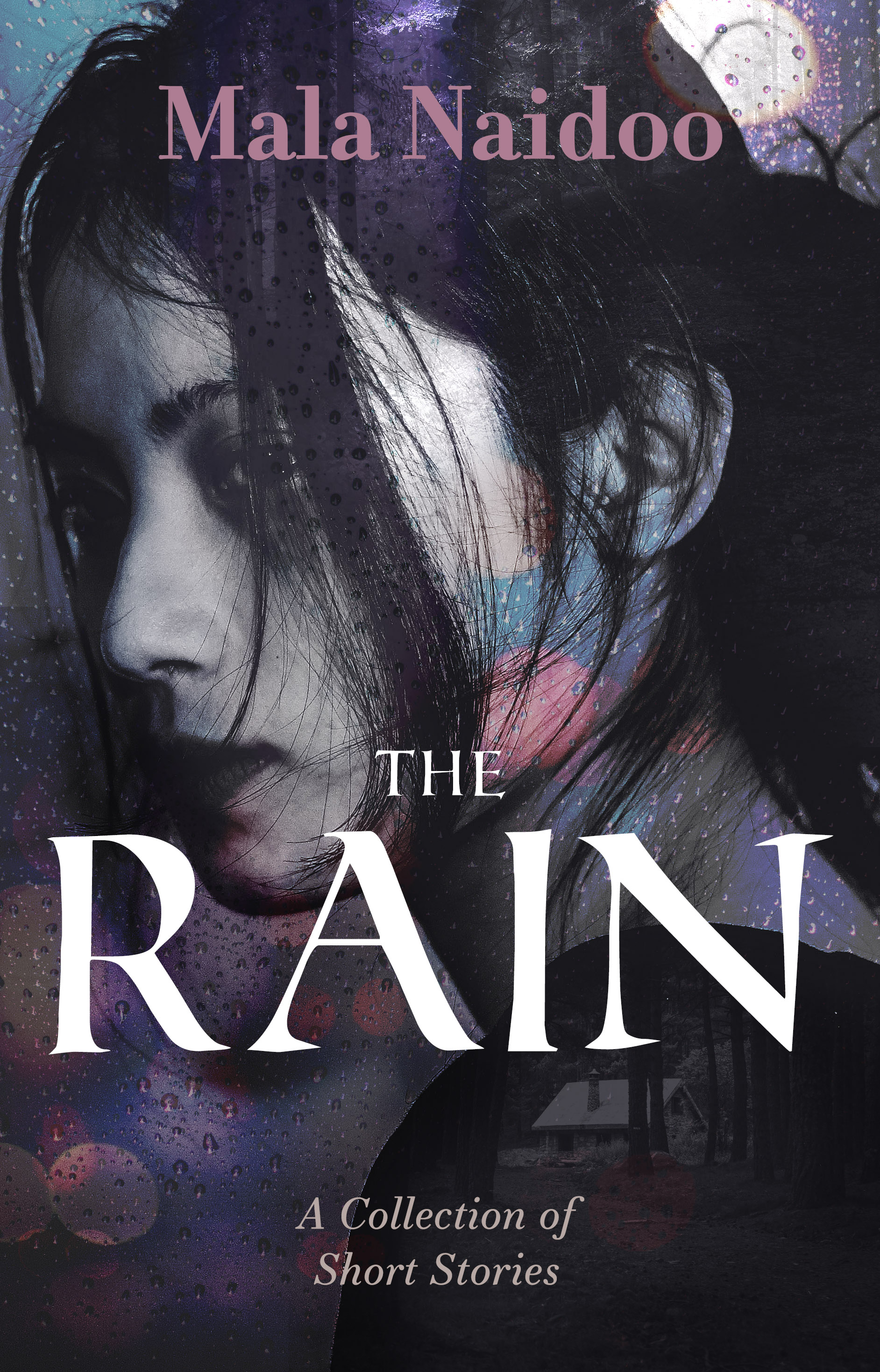
Mala Naidoo writes literary fiction — she prefers evocative, atmospheric cover images. For this collection of short stories. the composition we designed incorporated four images, including the barely visible hut in the woods (featured in one of her stories). The title typeface is Roman SD and the subtitle and author name use Essonnes.
Life Advice_Book Cover Design
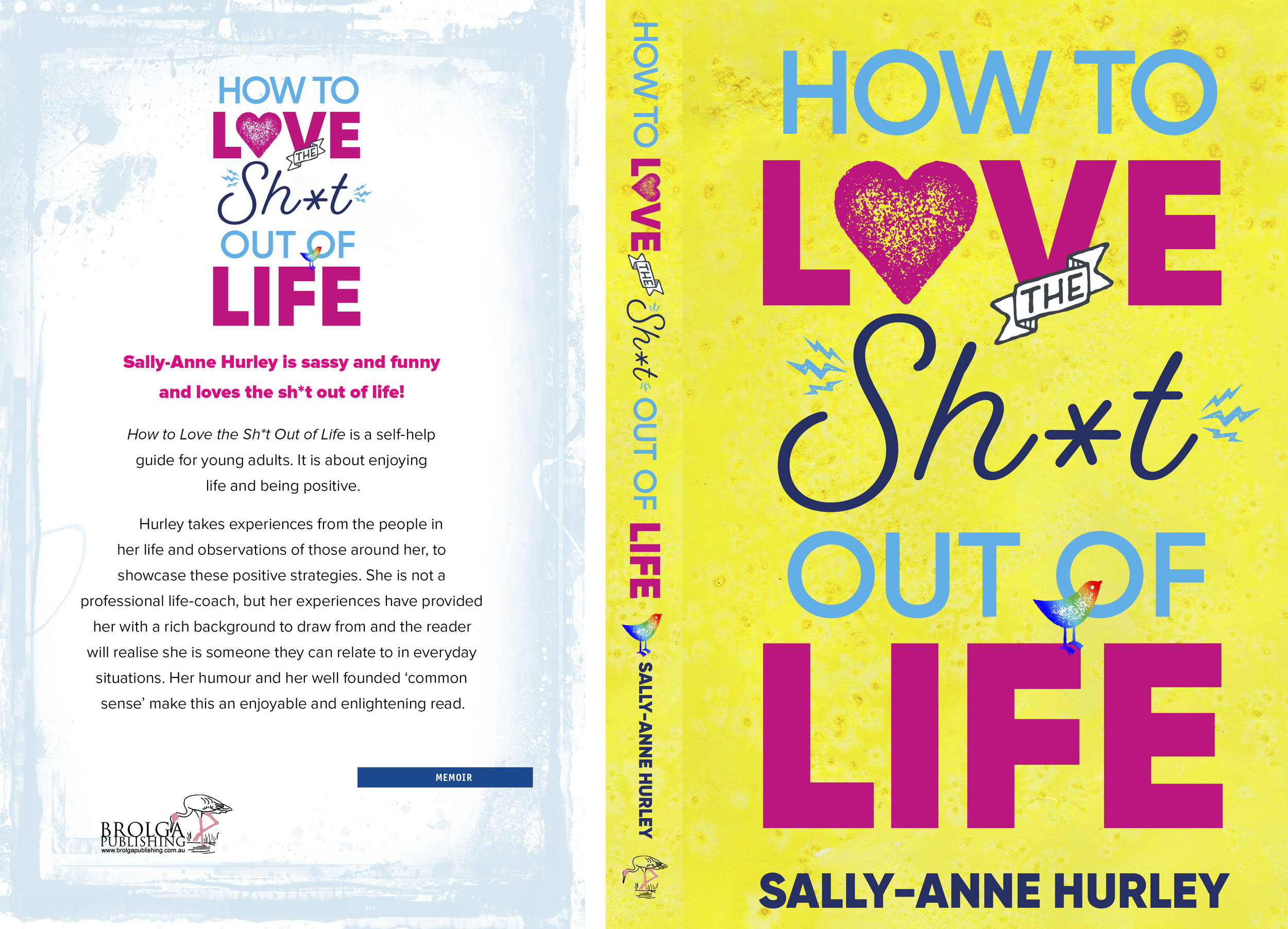
Typefaces: Eveleth and Proxima Nova. Published by Brolga Publishing.
Author Testimonial #6

“Working Type Design created the cover of both of my books The Shed and Underneath my clothes. Luke was fantastic to work with and so patient with me when it came to layouts etc People comment all the time on how great my book covers are...especially The Shed.I can highly recommend Working Type Design.”
Author Testimonials #5
“I would strongly recommend you to anyone requiring this kind of service. I absolutely love it. Thank you so much. You are a genius.”

Client Testimonials #4
““Your cover is receiving accolades galore...you must take several bows and be delighted with the response to what I felt was an amazing depiction of the book. In this instance you CAN tell a book by its cover!!””
Client Testimonials #3

““The final viscomm textbook looks really really nice. The manager here even said it’s one of the best looking books we’ve done, and that is in no small part due to your cover and text design, so thanks again for your impressive work and help on that.””

Greek Courage
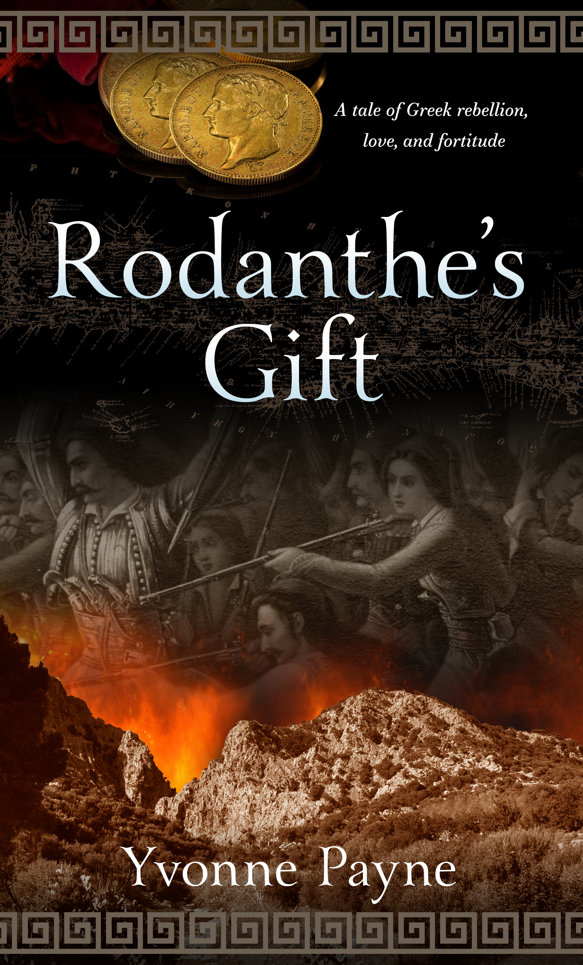
In the early 19th Century Greek patriots began the long and bloody process of re-establishing their independence after centuries under the Ottoman yoke. Yvonne Payne's story Rodanthe's Gift dramatises aspects of the rebellion that took place in Crete. We combined images of a mountainous Cretan landscape, gold Napoleons and a contemporary artwork. The title type is Yana. More information here.
By the Book — Cover Design
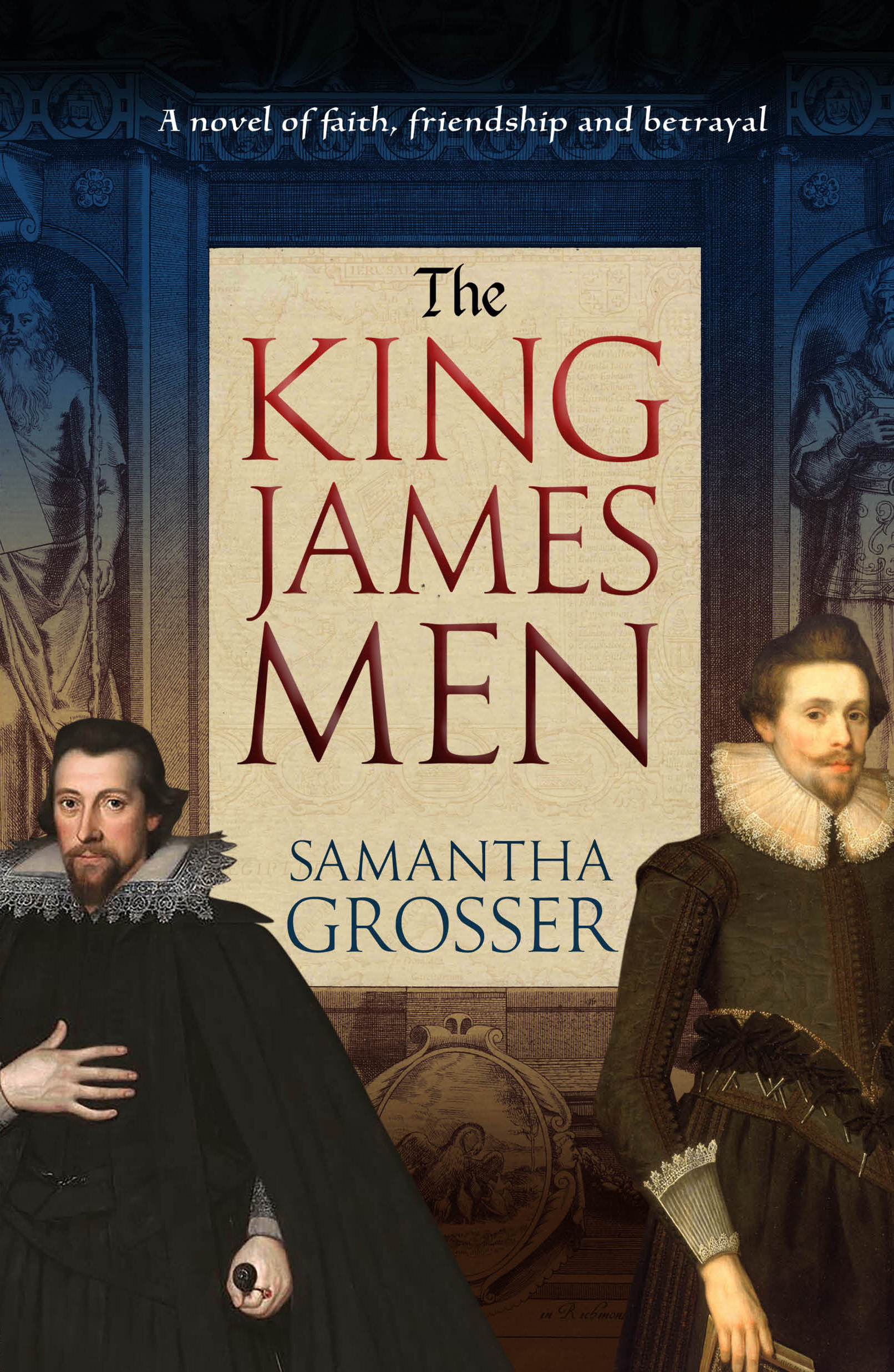
Often described as the only masterpiece ever produced by a committee, the King James edition of the Bible remained influential for several centuries. Samantha Grosser explores the world of the people who created the King James Bible, their aspirations, allegiances and betrayals. We used the frontespiece of the 1611 edition of the bible, along with contemporary portraits and a muted colour palette.
It's a Gas Gas Gas

Natural Gas Volume 03
Cover design for Volume 3 in a projected 4 volume series on natural gas. Bright primary colours, bold simple typography and industry-related images.
Attunga — Science fiction book cover

Peter Wood has written an engaging and optimistic take on a future solar system. We wanted to depict an advanced interplanetary civilisation, and also bring in dolphins (cetacean intelligence is a major thread in the story) and the asteroid belt. Typefaces used were Trajan Sans, Conduit and Beloved Script. Peter's website is here.