How to Engage Readers Through Graphics and Design
Eleanor Hecks discusses the importance of graphic design in enhancing the reader experience:
Authors live in an age where attention spans are dwindling and competition for readers is fiercer than ever. Today, readers crave stories that capture their imagination while captivating their senses.
For writers and book designers, this is where visuals become a must-have tool for deepening engagement and enhancing the storytelling experience. Whether through a book cover or carefully crafted book opener, graphics and design can amplify a narrative’s impact, making it linger long after the final page.
What Visual Storytelling Is and Why It Matters
Visual storytelling is the art of conveying a narrative through images, typography and design. It goes beyond the written work, enhancing a story’s emotional impact and immersing readers in its world. For authors, visual storytelling is the connection between content and experience. It creates a richer, more engaging passage for readers.
In publishing today, this system has become increasingly important. Consider that publishers and independent authors sold over 767 million print books in 2023. When you factor in e-books, the figure climbs even higher. With so many options available, authors must find ways to stand out, and designs are one way to achieve that.
Visual storytelling is crucial because it fits the human brain’s natural preference for visuals. Humans prefer graphics over text because of a phenomenon called picture superiority, which psychologist Allan Paivio studied. According to Paivio’s dual coding theory, humans store visuals in two ways — as an image and as a word or phrase that describes the image.
In contrast, humans only store words as verbal representations. This means images are inherently more memorable, making visual storytelling better for capturing and holding readers’ attention. By integrating visuals into books, authors can create more relatable narratives on multiple levels.
Key Components of Visuals in Books
When adding images to content, authors create an experience that complements and enhances the narrative. Understanding the key components of graphics can create lasting impressions on readers. Success depends on the type of experience created, as 80% of consumers now consider it to be just as important as the quality of the product when making future purchasing decisions.
To give readers what they want, the visuals must contain various components, including:
Carefully combining each of these elements enables writers to produce books that are visually appealing and emotionally impactful.
How Authors Incorporate Graphics and Design
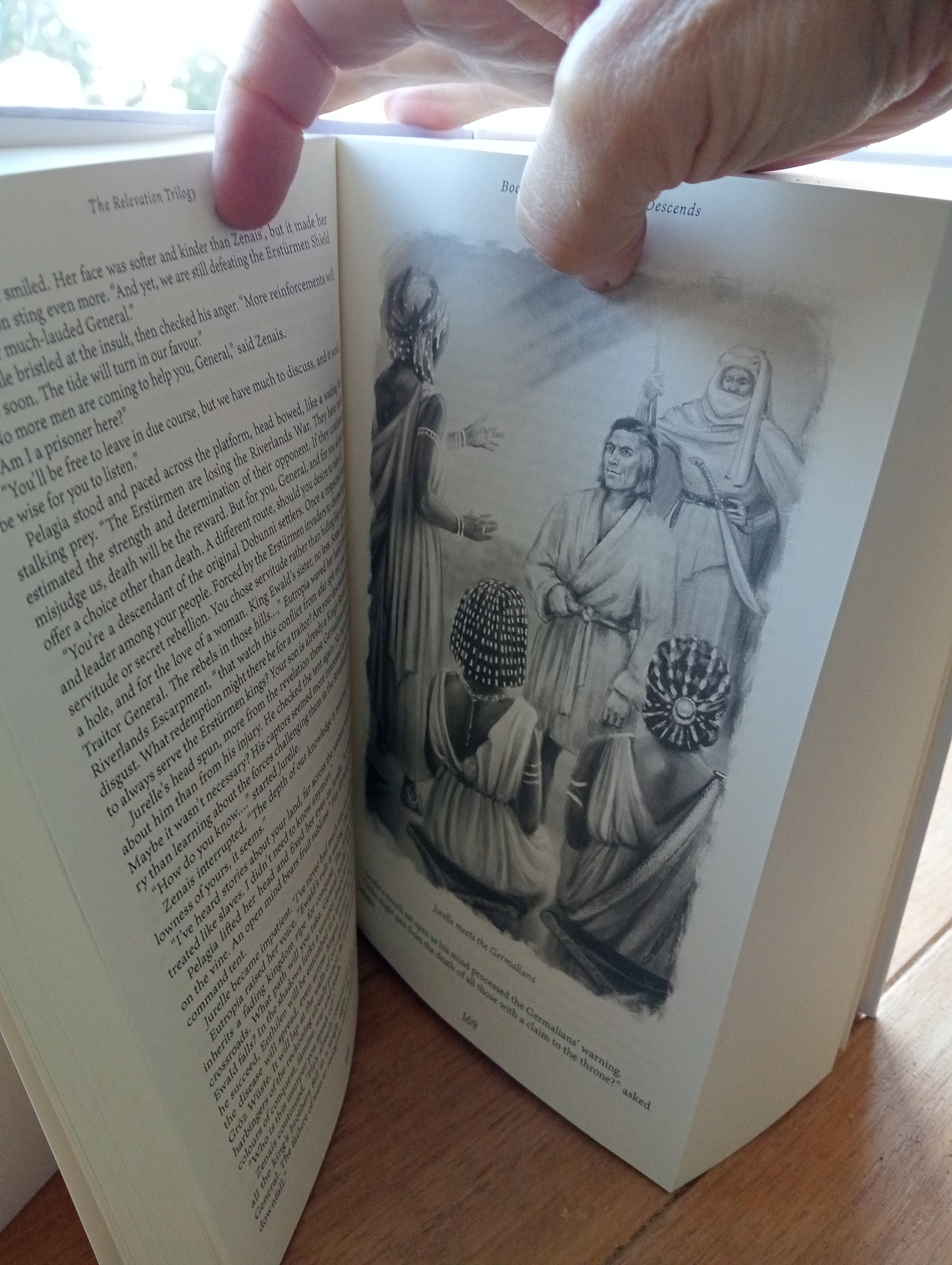
Today's authors find creative ways to weave graphics and design into their storytelling, making books more dynamic and engaging. In fiction, many successful authors add maps to orient readers in complex fantasy worlds or use character illustrations to breathe life into protagonists.
In nonfiction, authors leverage images like infographics, charts and diagrams to simplify complex ideas and present data in a digestible format. For memoirs and biographies, authors typically include personal photos or handwritten notes to add authenticity and emotional resonance. By incorporating visuals strategically, they can enhance the reader’s connection to the content while making their books distinctive.
Ways to Engage Readers Through Graphics and Design
The following strategies offer ideas for authors and designers to use graphics and design elements to captivate readers.
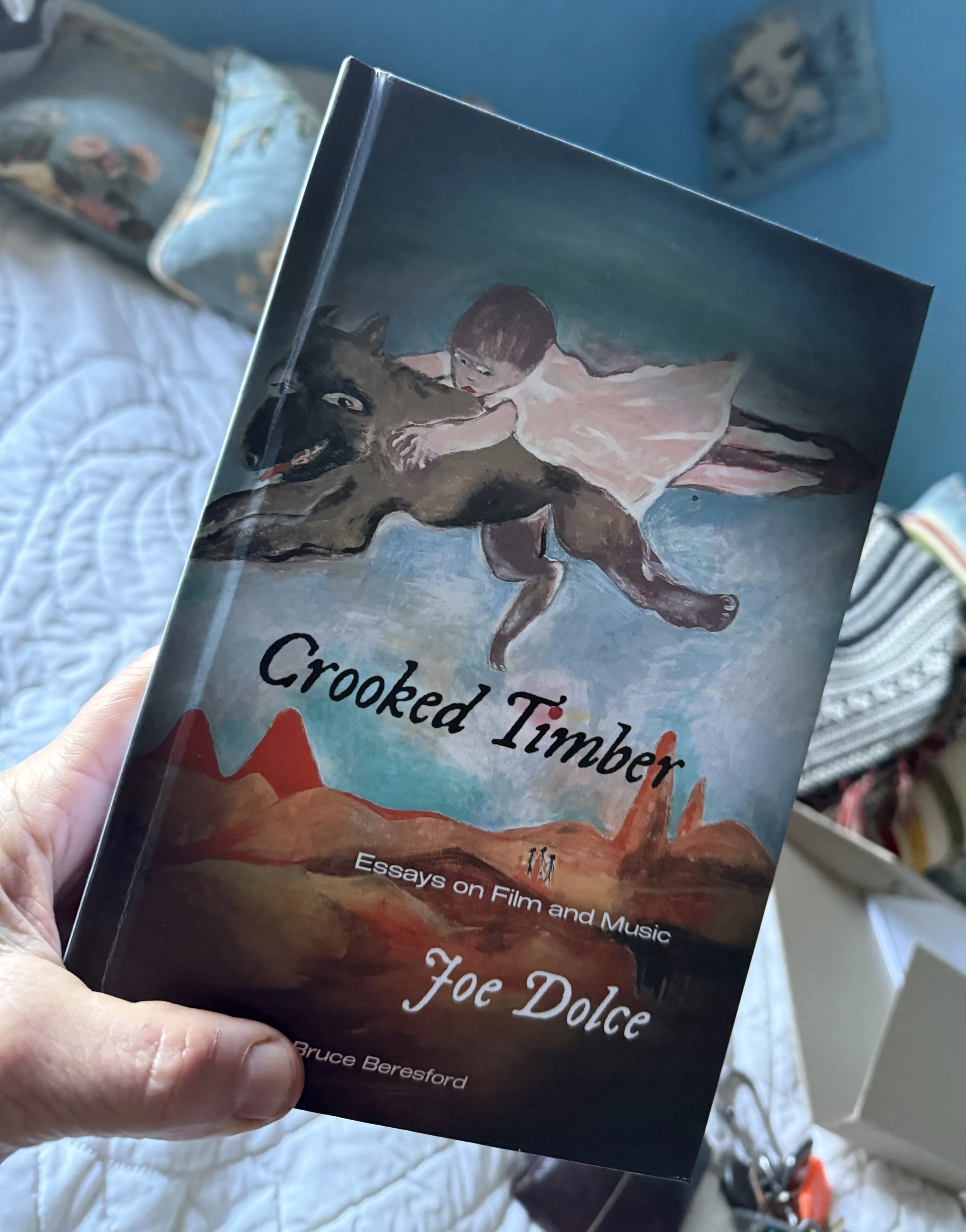
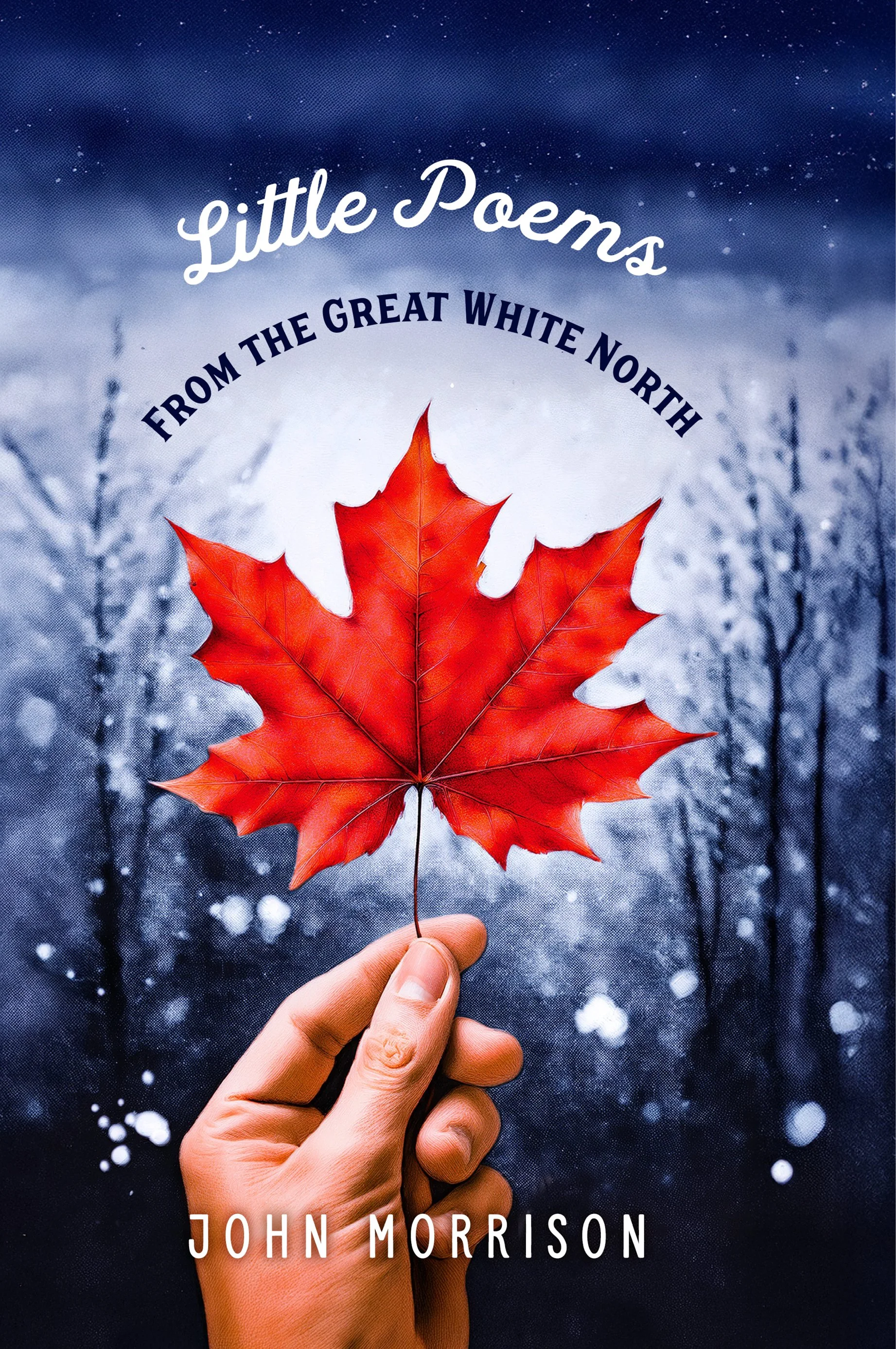
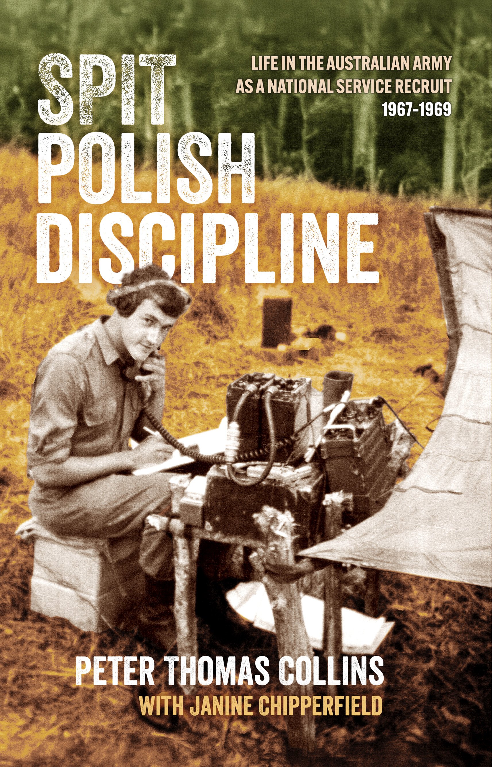
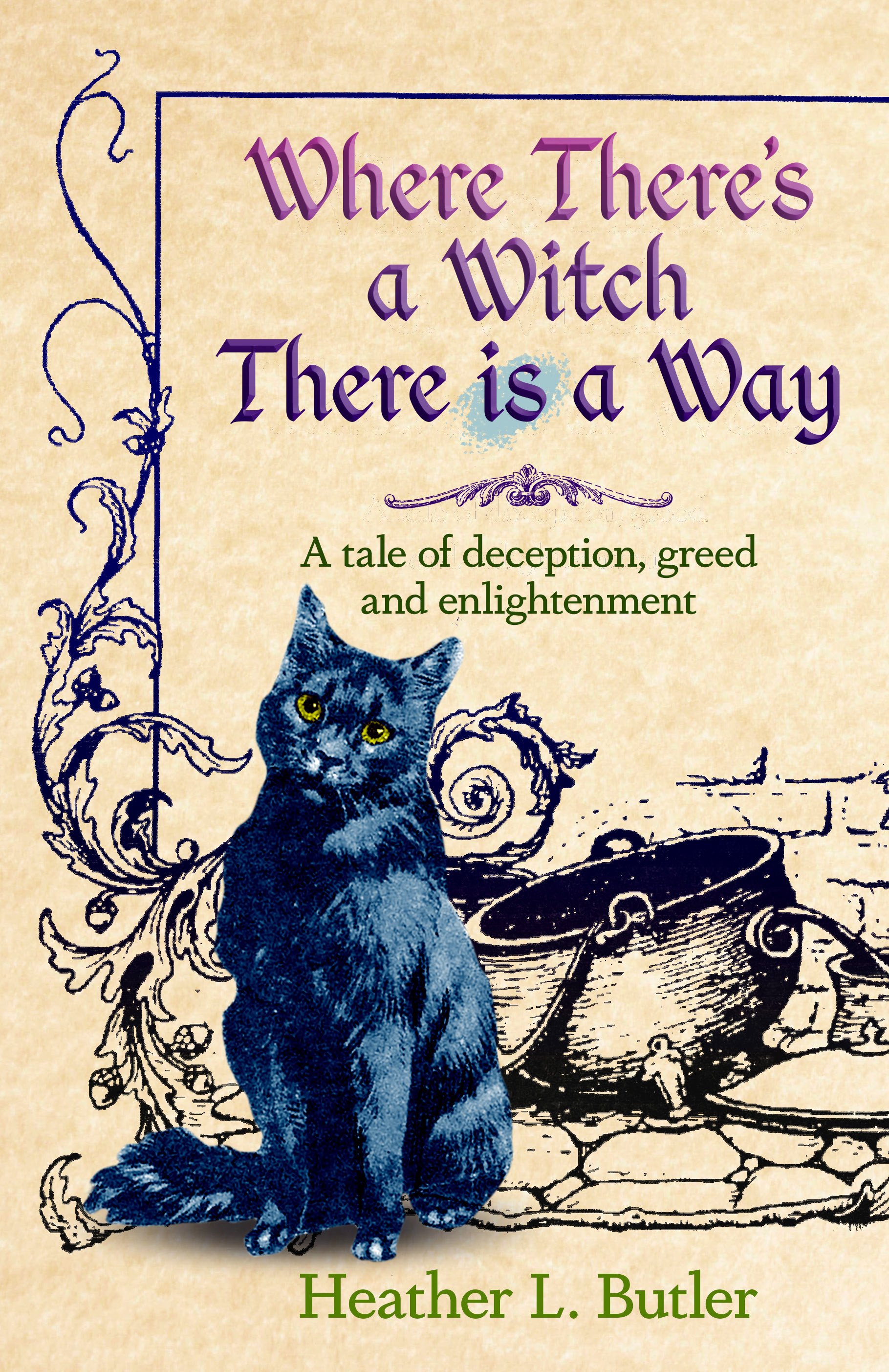
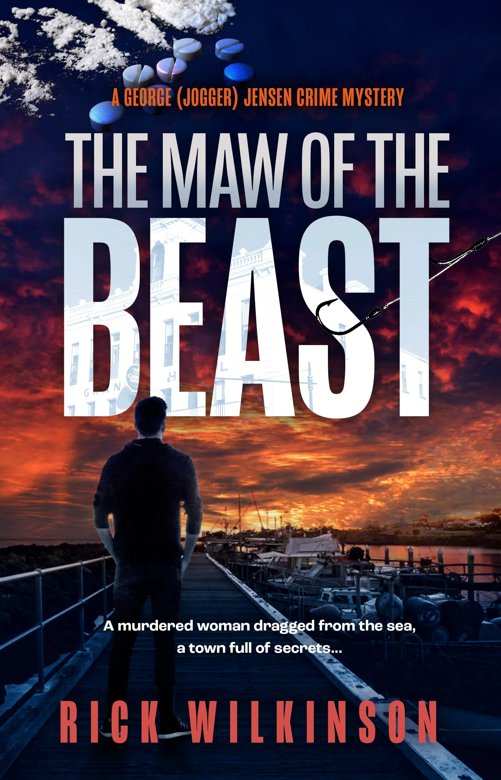
1. Leverage Beautifully Illustrated Covers
An evocative cover is a great way to capture potential readers at first glance. The new Game of Thrones covers’ design perfectly exemplifies this. The series “A Song of Ice and Fire” uses traditional linocut art to create intrigue about the world the reader is about to enter. The covers perfectly capture Westeros and the danger that lurks within it, garnering attention and setting the tone for the epic narratives.
2. Design Immersive Chapter Openers
Whimsical chapter headers or illustrations can provide readers with visual cues. Such elements offer a glimpse into upcoming events, building anticipation and enriching the storytelling experience.
3. Add Visual Easter Eggs
Inconspicuous visual elements that follow the story’s plot or characters can delight attentive readers. These hidden gems encourage deeper engagement, as readers feel rewarded for their attention to detail.
4. Use Pull Quotes and Decorative Elements
Impactful lines with elegant designs draw the reader’s eye to significant moments. This technique spotlights key passages, amplifying their emotional connection and making them more memorable.
5. Experiment With Text Layouts
Creative typography can accentuate pivotal moments or emotions within the narrative. Authors can deliver intensity, urgency or tranquility by varying text placement and style, adding another dimension to the reading experience.
Turning Stories into Immersive Reading Experiences
Authors must use visual storytelling through graphics and design to connect with today’s readers. Visual storytelling elevates a book from a story to an unforgettable reading experience. As readers increasingly value the experience a book provides, investing in visual storytelling is a strategic creative choice. Start experimenting with visuals to convert stories into ones that readers will cherish.
Eleanor Hecks is a writer and web designer who is passionate about helping other writers grow their online presence. Her work can be found on her site Designerly, as well as publications such as IndependentPublishing.com and I Need a Book Cover.