Author and traveller Jacqueline Hodder describes the process she went through in choosing a book cover designer (spoiler alert: she used WorkingType Design).
Book Cover Design for September 2021
A few of our recent covers and cover drafts, covering the usual broad range of subject matter. Striving for high contrast and high impact and interesting type combinations.
Book Covers for August 2021
A few recent book covers, from thoughtful spiritual tomes to legal advice…
More Recent Book Covers and Drafts from WorkingType
How to Write a Good Cover Design Brief
The benefit of a good cover design is that it has the potential to turn a curious or potential buyer into a purchaser. For the author, a striking book cover is the most powerful marketing tool which can mean the difference between the success or failure of a book.
Approaching a designer
When considering having a cover design created by a professional graphic artist the author must have a clear idea of what would be the ideal finished product. However, that is not to say that the designer's flair should be constrained. By paying for expertise in graphic design, a certain amount of freedom is granted to the artist to be 'creative'. Constant communication throughout the design process will mean that feedback can be exchanged which should allow for the author to receive a finished cover design that will be fit for purpose and not merely what the designer wanted to produce.
It should be remembered that the role of a 'brief' should be to provide succinct instructions while allowing the designer the freedom to be creative. A creative brief will provide a useful framework in which the designer can work within margins without having creativity compromised. The author should provide guidance only, regular and honest feedback will be the secret to developing a successful cover design. The author must make clear to the designer any information regarding items which 'must' appear in the design.
For the designer to be able to use his creative skills to the full it will be necessary for the author to provide a precis or synopsis of the contents of the book to allow the designer to 'get a feel' for the content and style of the work. The genre and target audience should be discussed to enable the designer to select the correct styles and fonts for the cover. The demographic, gender and age of the target audience should be made clear. If the book is part of a series, the author should provide details of fonts, colour schemes and any famous logos as part of branding already in use. Precise details of sizes, resolutions and file formats should be provided to the designer to allow for continuity in the finished product.
Dealing with technical issues
Throughout the process of designing the cover, it will be important for the author to remain in contact with the designer. At this stage it will be necessary for the size of the cover to be discussed along with its utilization; will it be used as an e-book cover, for a traditional printed book or both. This information will be necessary as the designer will need to know the dimensions and the amount of space there is to work with.
The wise writer will utilize the designer’s expertise, creativity and experience to produce the most appropriate artwork for the book cover. Try not to be too rigid in requirements and give the designer freedom to work without the author indulging in micro-management of the project. There are various colors and fonts which will appeal to the different reader groups and genres. Give any information concerning specifying colors or any preferred fonts. These elements will set the tone of the cover and should reflect the content of the work as close as possible. Constant communication between author and designer can build trust and bring about high-quality results.
By looking at other, similar books already published it will be possible to understand what colour schemes, images and fonts are used on the most successful titles. As previously mentioned, a carefully crafted cover can turn potential purchasers into buyers, particularly in the case of e-books, where the cover is the thing that will, hopefully, attract the interest of potential buyers.
Conclusion
When consulting a graphic designer to provide a cover for a book the designer must be given a complete oversight of what the subject matter and content of the book concerns. This would be achieved in an ideal world by the designer reading the complete text, unfortunately, it is generally impractical. The author should therefore provide a synopsis of the text contained in the book to allow the designer to get 'a feel' for the project.
The author and designer must agree on terms regarding consultation during the development of the cover so that any modifications can be made before the project has advanced too far. There must be a very high level of trust between the two parties if the project is to be a total success. When evaluating the progress of the project, the author should be 'firm but fair' in any criticism of the work provided by the designer. Conversely, when the work is considered to be of a high standard and entirely acceptable to the author, praise should be forthcoming and positive feedback given regarding working with the designer.
Providing the designer with an accurate precis of the subject matter, offering support and assistance during the process and allowing the designer to 'do his job' will result in a final cover which will be a huge asset. The promotion and ultimate sales of the book will benefit and it will be a useful addition to the portfolio of the designer. This will be a win-win situation for all concerned.
Author Bio: Kieran Fallon is the owner of a Dublin Graphic Design Agency Éire Graphic Design. We are here to help your organisation become more memorable through designing striking logos, eye-grabbing flyers, posters that pop, exciting animated emails and dynamic lightweight digital advertising campaigns – always backed by flexible and insightful support.
Shore to Shore cover — Exploring the Mornington Peninsula
The Queen of Limnos receives media attention
Academic and author Tony Whitefield recently published The Queen of Limnos, an interpretation of the Ancient Greek story of Queen Hypsipyle. Neo Kosmos ran an interesting story on his book. The article quotes the author:
WorkingType designed and typeset The Queen of Limnos earlier in 2020, and we’re pleased to hear the book is selling steadily.
A New Series for Peter Ralph
Writer of financial thrillers Peter Ralph is embarking on a new series featuring Josh Kennelly, a character first introduced in Fog City Fraud. The first book, Deadly Bequests is “set in New Orleans and is a scam about the elderly getting fleeced via their wills.”. The second book is The Guardians . Josh “receives a crazy call from a veteran of the Afghanistan war claiming that his father has been kidnapped by a guardian. Reluctantly, Josh gets involved and discovers the guardianship industry where judges, guardians, lawyers, and doctors, look after themselves, but not their wards. The forces that he’s trying to expose are all-powerful. Has he bitten off more than he can chew?”
We designed all three books to have a consistent identity and repeated elements.
Good News with Mal Walden — Book cover
Right in the middle of the Carlton Readings shop window, Mal and his book (Good News) do leap out at one somewhat… stand aside Walter Isaacson and Carole King. Published by Brolga Publishing, cover design by WorkingType.
Italian Bel Canto — Book Cover
Joseph Talia writes about great singers and their teachers, and the science of singing. We populated the cover of his latest book with luminaries from that world. from Dame Joan Sutherland back to Rossini and Farinelli. And in the background, an amazing piece of art from Rococo master Giovanni Tiepolo. Published by Australian Academic Press.
Ellen Hansa and her novel, Esther's Violin
Cover note: The background image is Ellen’s father’s ex libris, flipped to make the letters semi-abstract forms. Typeface is Mostra Nuova. Body text is Arno Pro.
May it be a camera, a lump of clay or a sheet of paper, Ellen Hansa manages to create a story. At the age of fifteen she tried to start a career as a photo journalist, an impossible task for a young woman in the late 1950’is in war-torn Vienna. She studied photography and with her masters’ degree under her collar, tried again. Having been rejected once more, Ellen spends the next years in photographic studios both in Vienna, Oslo and later in Melbourne.
After her marriage and three children, Ellen tried her luck turning clay into pots. A few years later Stanyers’ Pottery was born and for many years the business flourished.
After her husband’s death Ellen withdrew to her bush block. A writing group in the local Neighbourhood House drew her back into society. She started telling stories again and compiled a number of short stories called “Stories around the Table”. Then she gave herself the big challenge to write and publish a fictional novel, Esther’s Violin.
Her work can be viewed here.
Fatal Path Cover — More Iterations
An update on an earlier post — two more iterations on this cover. Sometimes it is a long and winding road to a final cover…
Three Cover Iterations: Twins, a rifle and a world of pain
Thrillers are an enjoyable design challenge — very bold use of highly condensed type, high contrast, extreme emotions and a certain cinematic touch. The Fatal Path is no exception to this general pattern. Here are three alternate versions of the same cover.
A Village in Crete — Cover Design
Kritsa is a small and very picturesque village just inland from the northern coast of Crete. Yvonne Payne has written dramatic historical fiction based on Greece’s fight for independence, and now a guide to Kritsa and the surrounding landscape. She wanted a cover in keeping with the earlier covers we designed for her, but showing the broader context of the town and also the smaller details of the streets. Typefaces used include Yana and Nexa.
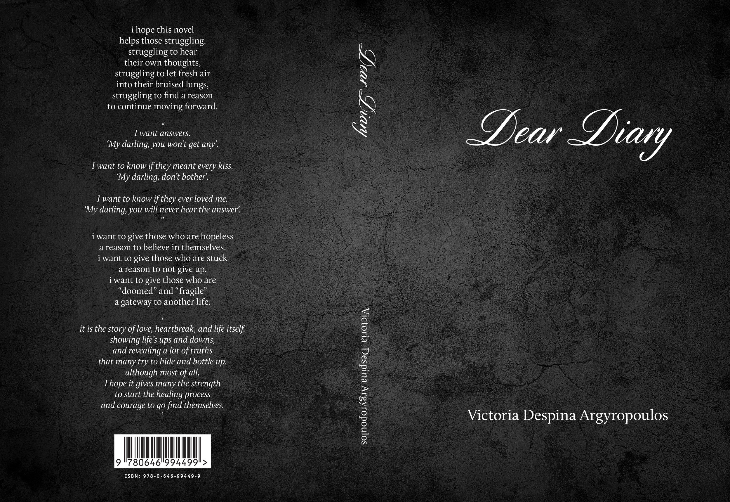
Dear Diary — Book Cover
Victoria Argyropoulos composed a book of poetry (Dear Diary) exploring the nuances of a relationship. She wanted a fairly stark cover with a subtle texture. The book was interspersed with her own photographs and many solid panels. She was very pleased with the print job:
We highly recommend the print management services of Tenderprint Australia. More news later re. the availability of this interesting volume.
It's the Gas, Gas, Gas — Book Cover Design
Dr. Harald Osel works in the global oil and gas industry and has written four remarkably detailed volumes on the industry he knows and loves. We designed covers for all four volumes of his magnum opus and typeset the text. Every aspect from exploration to extraction and transport is covered, along with issues of environmental preservation and clean energy. Published by Aurora Publishing. We maintained common design elements for al four covers and used images that reflected the topic covered by the specific volume. Typeface used on the covers: Proxima Nova (various weights and widths).

From Revolution to Reflection — Book Cover
In his youth James O’Brien was a republican firebrand, campaigning against the British presence in Northern Ireland and sympathetic with the aims, if not always the methods, of the IRA. Time and experience mellowed his views and he left Ireland for a prosperous life in Australia. We designed the cover for his memoir some years ago, and recently adjusted the layout for an audio book version he created in conjunction with Findaway Voices.
Joe Darling Book Review
A book we designed last year has come to the attention of a popular cricket site. In addition to saying many positive things about the content, the writer also touches upon the design:
Change and Time — Cover Design
Mala Naidoo depicts complicated human relationships in her novels, her authorial eye remaining consistently wise and warm. We wanted to convey the depth and subtlety of her protagonists, opting for a dramatic sky with layered faces and a large, classical serif typeface (Mort Modern).
Life Advice_Book Cover Design
Typefaces: Eveleth and Proxima Nova. Published by Brolga Publishing.