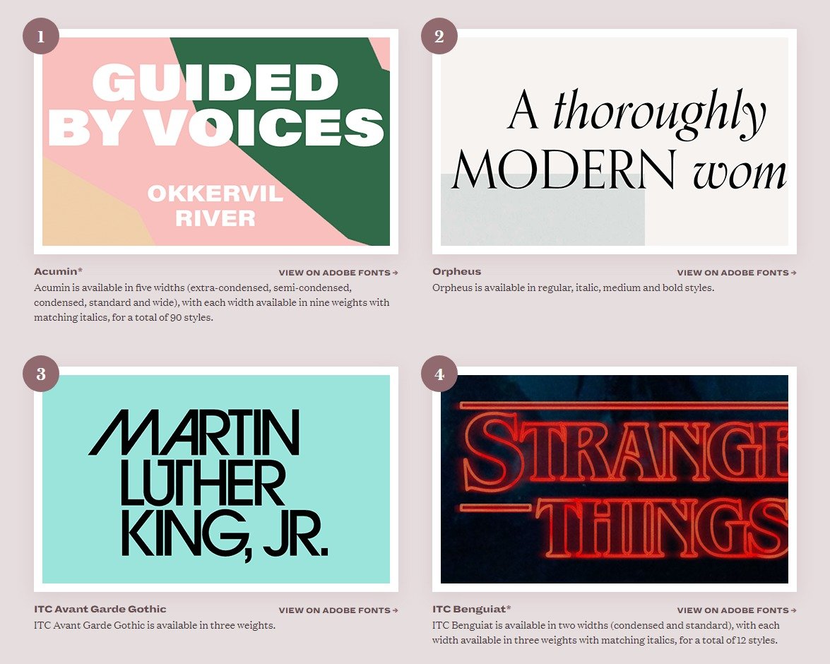
An interesting survey of the best typefaces available via Adobe fonts. Google fonts are also worth visiting, as are Font Squirrel and Lost Type.
Uncle Sam is Your Type (supplier)
It seems like everyone is getting in on typefaces: Alibaba one day, the US Government the next. Public Sans is a multi-weight open source sans with a strong presence. Students of type design will notice Public Sans’ debt to Franklin, a seminal American type design.
Principles for Combining Typefaces
From the great online Smashing Magazine, an old post (but a goodie) on combining typefaces in a layout. An interesting table rating type combinations for 22 commonly used typefaces.
Free and Nearly Free Fonts
Hundreds of websites cater to the Internet's limitless appetite for free typefaces. Only a few restrict themselves to high quality fonts. Font Squirrel is one such, and Lost Type allows users to pay what they want for their font of choice. Some of the Font Squirrel offerings have multiple weights, and a few are issued by commercial type designers, such as Plex, a huge font family commissioned by IBM.
Noto — A Typeface for Every Language
Google has an endearing penchant for quixotic projects. Noto is that, but also a noble effort to construct a completely inclusive set of typefaces — covering all of the world's major scripts but also most of the minor ones. The name is derived from 'no tofu' — the little white squares that pop up when one attempts to type a character outside the character set of the font in question. The font itself is fairly vanilla, but highly readable and comes in four sans and four serif weights, and is free from Google.
Why Type Selection Matters (or How Not to Give People a Reason to Stop Reading)
Matthew Butterick at Practical Typography makes a great argument for considered type selection and use. A great line from the essay:
Slab Serif Madness
Not for me the genteel serifs of a Caslon or a Garamond. I prefer a typeface that makes a virtue of its serifs, and the slabs are squarely in that category. Slab serifs are sometimes heavy to the point of absurdity, or vanishingly thin. What they all have are prominent, unapologetic serifs. To me, the serifs look like purposeful feet marching across the page. Slabs are sometimes called Egyptian, a artefact of a brief European fascination with all things (Ancient) Egyptian. The style owes nothing to Egyptian writing styles, and is rooted firmly in the European typographic tradition. Other characteristics of the slab are minimal stroke width variation, and a large x-height. Their strong personality makes them natural attention-getters.
Favourite Slabs:
- Clarendon
- Rockwell
- Guardian Egyptian
- Stag
- FF Unit Slab
- Sentinel
- Archer
- Geometric Slab Serif
- Museo Sans