Material Design 3 is the sophisticated underlying design scheme / language / science that underlies Google’s massive presence on the web. It deals with typefaces, colour schemes, icons, accessibility, navigation and more, and has a very large number of moving parts, including an interesting new colour model.
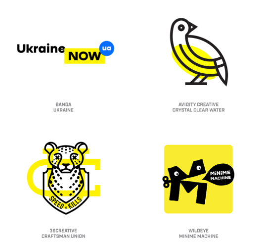
Go Go Logos
Logos continue to evolve apace in the mainly digital design world. Some attractive trends, some pretty ugly, as showcased here.
Tales of Mice and Men — Book Cover Design
Les Pobijie writes of a vanishing world — a small Australian town with an actual functioning newspaper. The tone of his novel is broad farce, with many mishaps and misunderstandings in store for the callow young journalist at the centre of the story. We combined a masked gunman, explosion, an authentic NSW pub and the intrepid hero. The typeface for the title and author name is Thunderhouse.
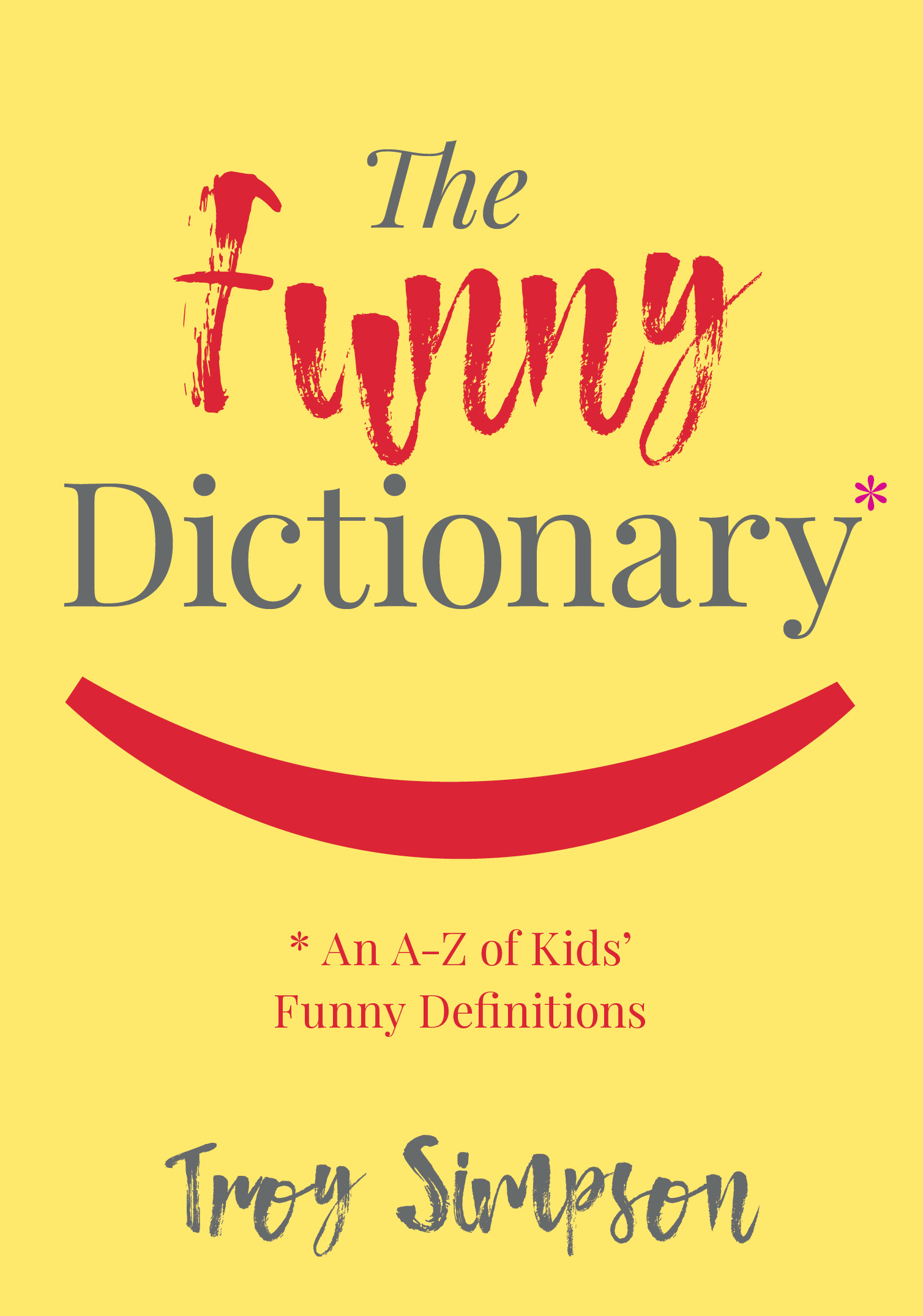
Funny Mistakes — Book Cover
The Funny Dictionary (published by the National Library of Australia) makes gentle sport of inadvertently amusing definitions written by children. Some of the "howlers" are accompanied by thematically aligned images from the extensive National Library photographic archives. The cover below was selected from many options generated by Working Type Design. The book is due for publication in the first half of 2018.
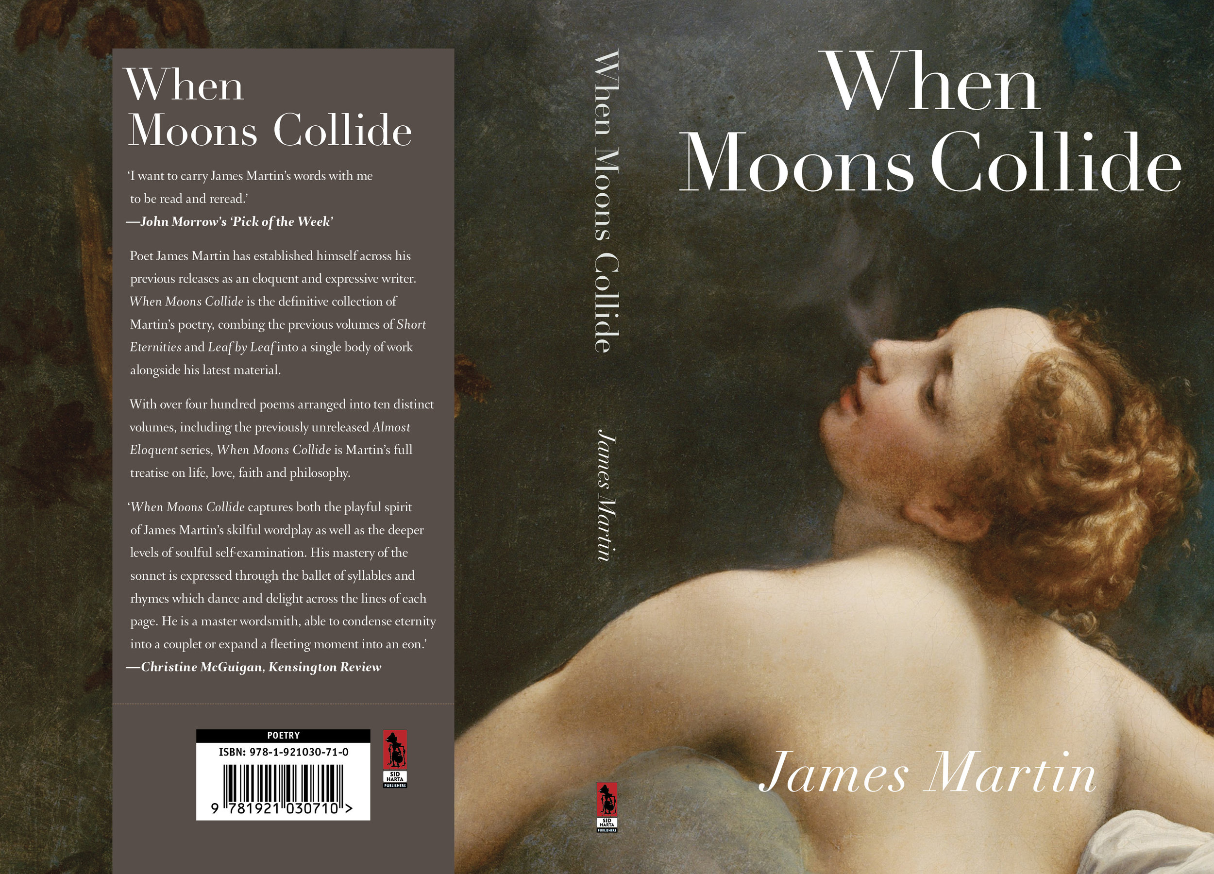
Classical Poetry — Book Cover Design
James Martin writes expressive classical poetry about the human condition. His latest book contains 400 poems dealing with life, love, faith and philosophy. Corregio's Jupiter and Io seemed perfect as the cover for this volume. The title typeface is Linotype Didot.
A Deadly Institution — Book Cover Design
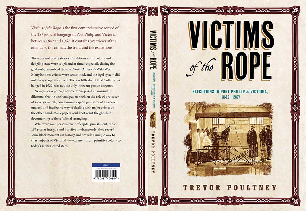
A cover design for a book discussing judicial executions in Victoria, Australia.
Read more