


Scripted Response — Three Posters


Noted editor and author Euan Mitchell commissioned three posters for screenplays he entered into American scriptwriting competitions. The above posters are the final drafts. Happily, he has received several awards for his scripts.
Recent Cover Design examples
A few recent cover designs, from high fantasy to Australian railway trips…


5 Reasons Why Book Typography Matters More Than You Think
A Guest Post kindly supplied by Desiree Villena:
Everyone knows that, if you want your book to sell, you need to hire a great cover designer. But many people don’t think about how important your book’s interior design is, as well. I’ve seen too many books, both self-published and traditionally published, that have clearly skimped when it comes to formatting, and as a design nerd, it makes me so sad.
But there’s much more at stake than just hurting artistic souls — think of the practical considerations. You may not realize it, but typography can have a big effect on a reader’s reaction to your book, whether they consciously notice the fonts or not. So today, I’m going to break down the five most important reasons why book typography matters for every book — including yours.
1. Professionalism
While the cover is easily the first thing readers will notice when they’re deciding whether to pick up your book, the typography is the first thing they’ll notice once they open it up. So it’s important that you make a good impression. Seeing a professional cover and a sloppy interior is like meeting someone in person and realizing that their profile picture was a lie.
If you ever doubt the impact that a font can have on your professional reputation, consider this: would you be more inclined to trust someone whose resume was printed in Times New Roman, or Comic Sans?
Similarly, your book will be judged on what kind of font it’s printed in. Perhaps not consciously — not many people can point to a book and go, “Oh, that’s in Garamond,” or “That looks like Caslon” — but the wrong font will make something feel off about the book.
But what makes something the “wrong” font? That’s where the other factors come into play.
2. Genre expectations
This is one of those things that you’ve probably never consciously noticed before, but once you do, you can’t not notice it. Different genres tend to be published in different types of fonts, and you want your font to reflect the contents of the story as much as your cover and title do.
For example, a quick survey of my personal library shows me that speculative fiction uses a lot of Palatino, whereas YA contemporaries are often published in softer, more “playful” fonts like Century Book or Bembo. You can also never really go wrong with Garamond, the most “bookish” looking font of them all. But it’s not always necessarily the perfect font, either.
And don’t forget about typography on chapter headings! Age ranges and genres follow trends here, too, with YA and middle grade among the most creative, and literary fiction setting a high standard for refined understatement.
3. Readability
Of course all fonts are technically readable if they contain all the letters of the alphabet. Unlike handwriting, the letter A will appear the same no matter how tired you are when you hit the key on your keyboard. But the truth is some fonts are just easier to read than others. It’s why we usually publish books in serif fonts instead of sans-serif, and it’s why we make the letters bigger in kids’ books than in novels for adults.
Here, it’s important to consider function over form. Font size, line spacing, and margins are all key factors to making sure that the font you’ve chosen will read well to your target audience.
Some fonts just have a natural size they look best at, but will that make your book too slim or too chunky? If you’re targeting older readers, is the font too thin and “fussy” to be read without squinting? The more you take into account, the better your book will be.
4. Fatigue
Readability plays into this, but it’s important enough that I feel it’s worth a separate mention. Because one of the downsides of poor readability is that readers are likely to tire of reading your work sooner — or even develop eyestrain.
Let’s face it: a lot of things demand our attention these days. From work to families to keeping the house in order to the sweet siren song of social media, it can be hard to find time to read at all. The last thing you want to do is make your book cause physical discomfort. There’s nothing more likely to make people to put it down — and perhaps never pick it back up again.
Good typography, on the other hand, is comfortable on the eyes, and can play a surprisingly significant role in whether readers perceive your book as a slog or a joy to read. That’s why it’s crucial to choose your font wisely.
5. Reader mood
You know the genre expectations we talked about before? A big part of the reason those exist is because different fonts subconsciously convey different “moods.”
These are most noticeable in splashy fonts that you’d use more in titles than in text blocks — a futuristic sci-fi font, an elegant hand-lettering font — but even the fonts you’d format a whole book in can have an impact. Some are stuffy, some soothing, and some just kind of dull. It’s important for your designer to keep these differences in mind and understand how the font of the chapter headings works together with the font of the story, in order to create a professional product.
Remember: choosing good typography is a bit of an art, yes, but it’s also a marketing choice. And marketing is a subtle game. Everything from the layout of your local grocery store to the color of your laundry detergent bottle has an impact on people’s buying choices. Why should books be any different?
Desiree Villena is a writer with Reedsy, a marketplace that connects self-publishing authors with the world’s best editors, designers, and marketers. She's very passionate about helping aspiring authors reach their dreams, and enjoys reading and writing short stories in her spare time.
A Promotional Strategy for "Summer at Urchin's Bluff" by author Eliza Bennetts

On writing a series:
Writing in series is considered the way-to-go when it comes to romance. Romance readers are voracious! I attend the yearly RWA conferences and they often talk about the fact that some romance readers read 7-10 books a week! This means that when they find a set of characters or a world they enjoy, they want to keep reading.
As an author, it pays to have more books down the line to service this need. I was lucky to latch on to this pearl of wisdom while writing the first draft of Summer at Urchin's Bluff, so that allowed me to ensure there was scope to have a supporting character who will feature as the main character the next book, and so on for the following two books. I guess, in a way, writing in series is it's own form of promotion. Each book works to promote the next. Well, that's the plan anyhow!
My writing life:
I think like most of us, for me writing was always a hobby - something to get me out of my head when I was stressing about work or family or whatever. I've recently found myself with a little more time to write, and I'm loving it, but I'm yet to establish a routine around my writing. I've listened to podcasts and read books that say you should blank out some time each day to write (eg. 9 - noon). I should probably do that, but I'm loathe to, in case it sucks the fun out of it! I don't want it to feel like a chore, but I guess if I want to do this as a career, I might need to consider it. At the moment I write every day, but not at a specific time, or for a specified length of time.
Marketing and Promotion:
So, my plan with marketing is really to take it slow. I do plan to look at Facebook ads and Amazon ads (I have purchased the KDP Rocket software) for the promotion of Summer at Urchin's Bluff, but not in an extensive way. I figure once I have more books on my shelf, any money I invest in advertising will be that much more effective. I do plan to look at BookBub, but not for book one, or two for that matter. I know they're hard to get, so I might wait to start trying (maybe once all four books in the Seasons series are released). As far as social media goes, I'm only active on Facebook. I know it's better to be everywhere, but with kids and work, and the whole writing-the-books thing, I don't have the time to service a ton of social accounts. This is an area I need to become more confident in. Every time I'm about to post (even just on that one platform) I'm always thinking, 'is anyone going to care about this? Is it spamy?' (not a word, but you know what I mean). I do know that building a mailing list is super important, so I'm working on that but it's slow going. I'm okay with things taking a while to build. I want to be doing this in 20 years time, so being number 1 from day 1, with book 1 is not really my goal (I mean, I wouldn't be upset if it happened!). I guess what I'm saying is that everything I do around marketing and promotion, for me, needs to be about steadily building a readership.
Summer at Urchin's Bluff is a contemporary seasoned romance (seasoned is the term we use in the romance world for a heroine over 40). It is available for pre order now across most platforms.
Available from these outlets.
Author Pat Kelly and her books

Pat Kelly writes well-plotted and thoroughly engaging historical novels populated by believable characters. Although her characters often face great challenges, she maintains a touch of humour and optimism. She is skilled at evoking lost eras and the way people saw the world.
Pat Kelly was born in Glasgow in 1938. When she was just over a year old her father was called up to serve his country and she barely saw him until she was about eight years old.
Perhaps as an escape, in early primary school Pat took to writing stories, which her teacher used to read out to the class.
In her teens and early twenties Pat wrote several books, sent them to publishers with a stamped return envelope, but never received any of them back, so had to retype them to send them to the next publisher. None were ever acknowledged or published.
Eventually, Pat married and was too involved with raising children to have time to write. In 1968 she arrived in SouthAustralia, with four children, as a £10 Pom. After divorcing after over twenty-five years of marriage Pat was contacted by a Manxman, Mike, she had known in her teens. They married and returned to the Isle of Man to live.
After Mike retired, in 1993, they followed the summers with six months in each country. While in the Isle of Man they ran a daffodil farm and were well known on the Island for their roadside stall, with an honesty box, selling daffodils and plants.
In 2014, the travel was becoming too much, so they moved to Australia permanently to live in Lakes Entrance, a beautiful, peaceful little town in Victoria.

When she moved to the Isle of Man, Pat left all her family in Australia. Mikes mother Lou, a wonderful lady took her new daughter in law under her wing and they had great conversations.
Lou had grown up in a tiny village in the West of the Isle of Man. The population of this village was around 20, but when the great war started an internment camp was built which eventually housed around 25,000 ‘enemy aliens’. As Lou told Pat about her childhood and this huge camp looming over her tiny village, Pat realised she was listening to history, a lot of which no one else alive could tell – and that if Lou died, all that history would be lost forever. So she wrote it's all down and turned it into a book called ‘Hedge of Thorns’ that was a great success on the island.
The research for this sparked Pat's interest in Manx history And she then went on to write a second book, ‘Smugglers Urchins’, set in the smuggling era on the island.
Her next foray into Manx history was the famous Laxey water wheel, resulting in ‘Shadow of the Wheel’.
Pat is currently working on a story which finds 14-year-old Manx girl being transported for 7 years for stealing a loaf of bread. She sails with the second fleet in a ship that was nicknamed ‘the floating brothel’.
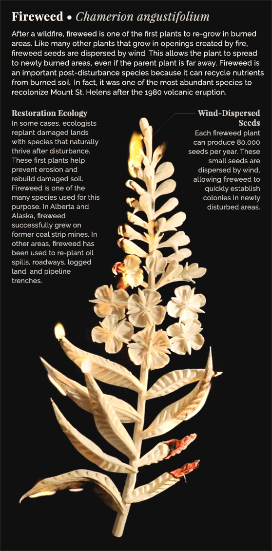
Amazing Science Graphics from Eleanor Lutz
For beautiful, jaw-dropping science graphics, the quirkily named TableTop Whale is an essential destination. Maintained by Phd student Eleanor Lutz, the work is astonishingly good. Hopefully she will produce something in print so I can read it to my children…

Go Go Logos
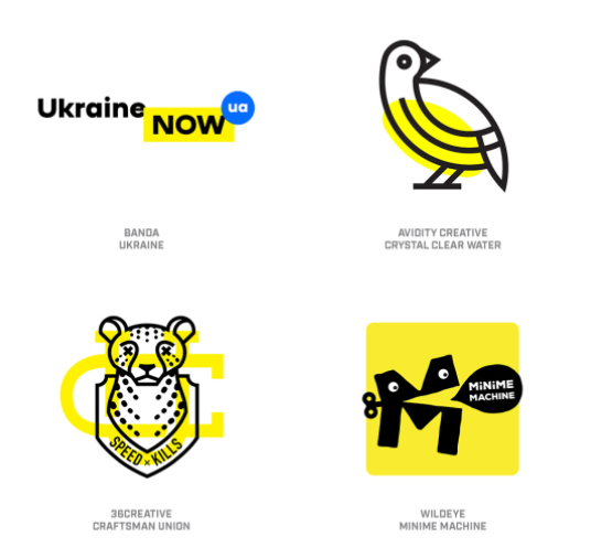
Logos continue to evolve apace in the mainly digital design world. Some attractive trends, some pretty ugly, as showcased here.
“Modern culture continues to shift the ways we interpret symbols and how we visually prioritize in context, setting topsy-turvy the relationship between identity and application. Greater credence has been given the attending visual vocabulary as texture, pattern, typography, photography and illustrative elements have shifted seats in the visual brand hierarchy. It’s becoming more common to see a brand driven by the supporting visual aesthetics, occasionally leaving the logo to call shotgun if it’s invited along for the ride at all.”
Troubled Times in East Timor — Cover Design
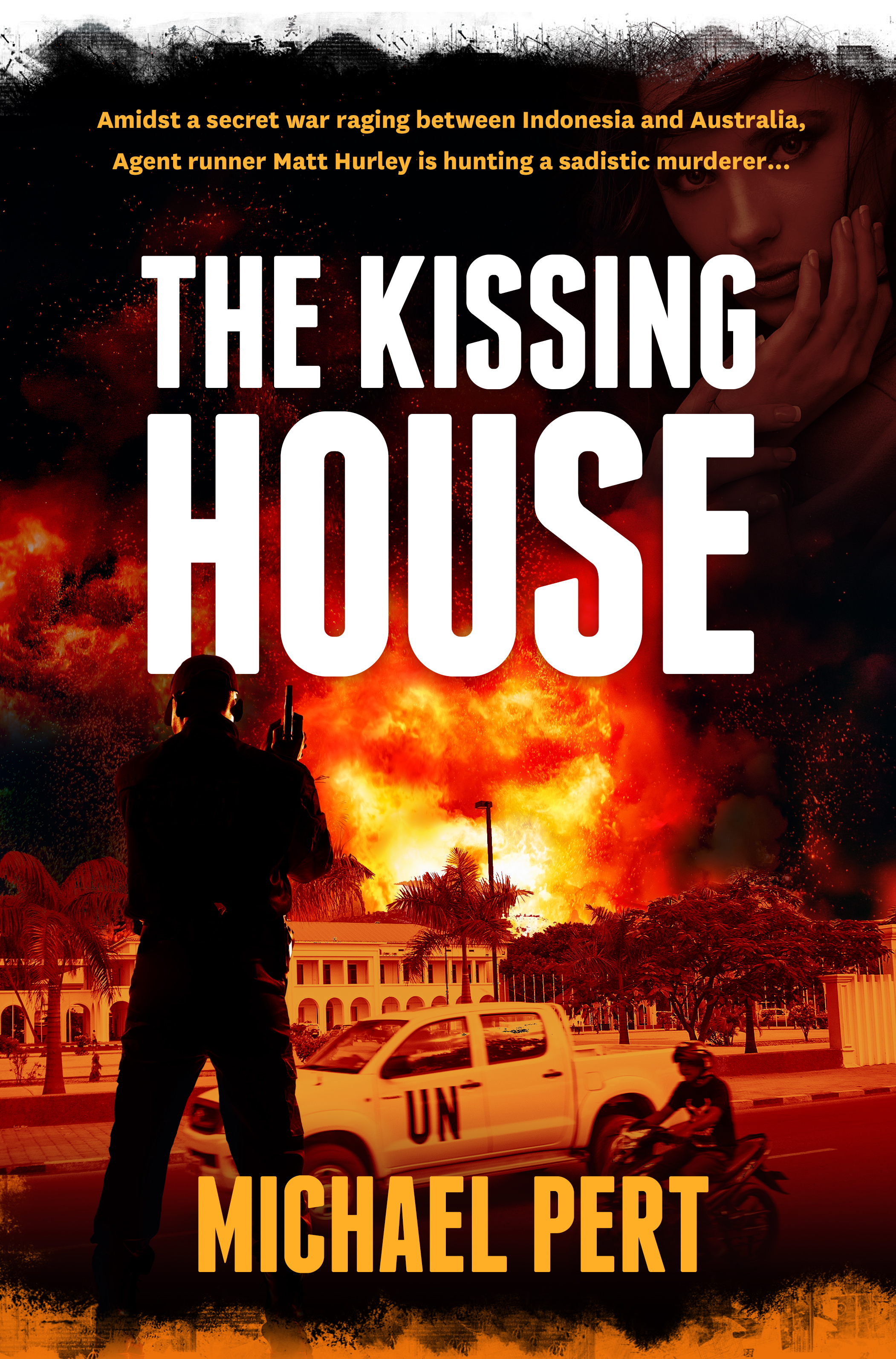
Michael Pert has written a taut, intelligent thriller based on Australia’s role in the troubled birth of East Timor. In the above draft cover, we blended images of Timor and a stark colour palette, and used the striking Franchise for the title typeface.
Uncle Sam is Your Type (supplier)

It seems like everyone is getting in on typefaces: Alibaba one day, the US Government the next. Public Sans is a multi-weight open source sans with a strong presence. Students of type design will notice Public Sans’ debt to Franklin, a seminal American type design.
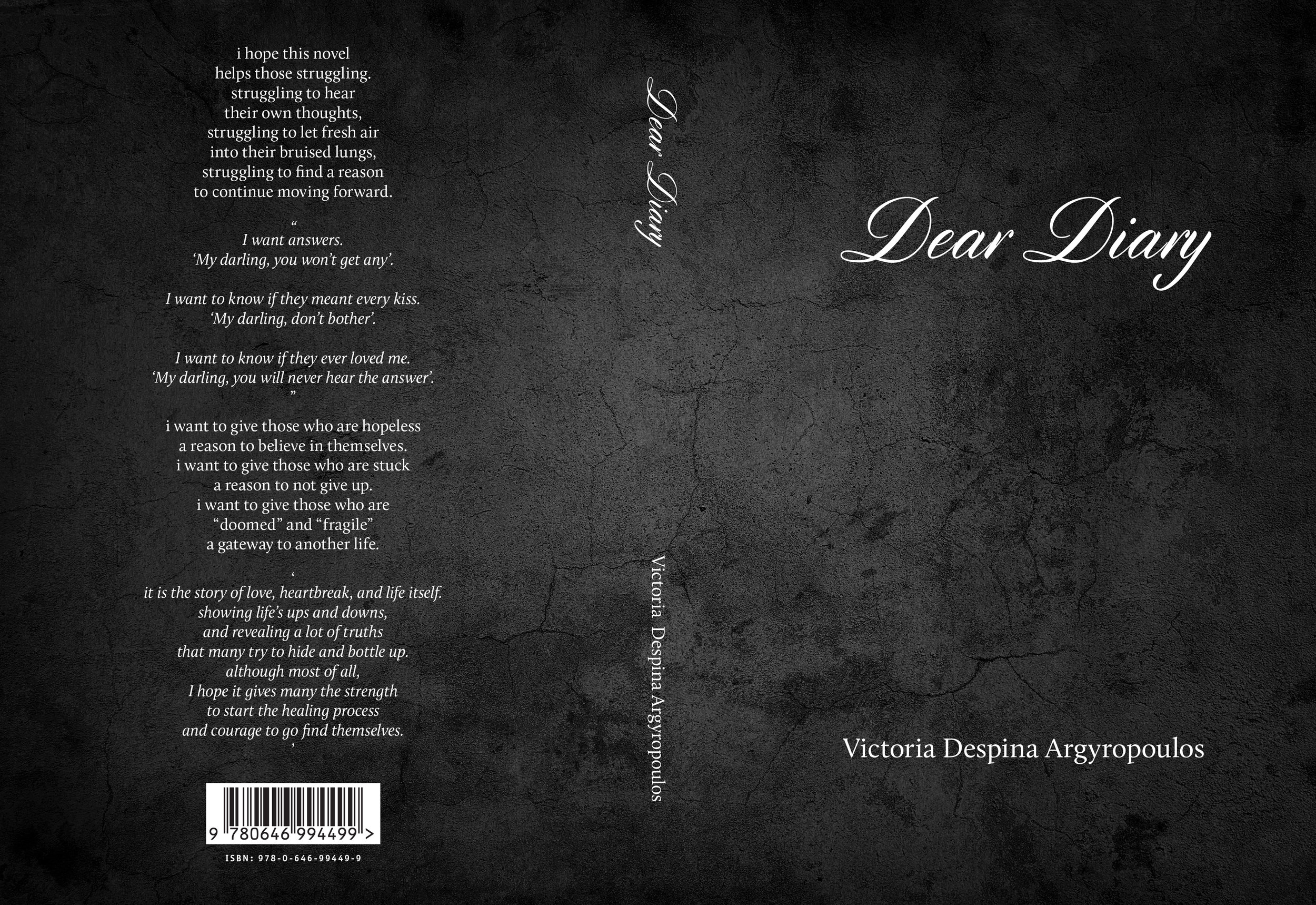
Dear Diary — Book Cover
Victoria Argyropoulos composed a book of poetry (Dear Diary) exploring the nuances of a relationship. She wanted a fairly stark cover with a subtle texture. The book was interspersed with her own photographs and many solid panels. She was very pleased with the print job:
“Yesterday I received the proof of my novel and it looks incredible. I was honestly left speechless.”
We highly recommend the print management services of Tenderprint Australia. More news later re. the availability of this interesting volume.

It's the Gas, Gas, Gas — Book Cover Design

Dr. Harald Osel works in the global oil and gas industry and has written four remarkably detailed volumes on the industry he knows and loves. We designed covers for all four volumes of his magnum opus and typeset the text. Every aspect from exploration to extraction and transport is covered, along with issues of environmental preservation and clean energy. Published by Aurora Publishing. We maintained common design elements for al four covers and used images that reflected the topic covered by the specific volume. Typeface used on the covers: Proxima Nova (various weights and widths).
Rain — Book Cover Design
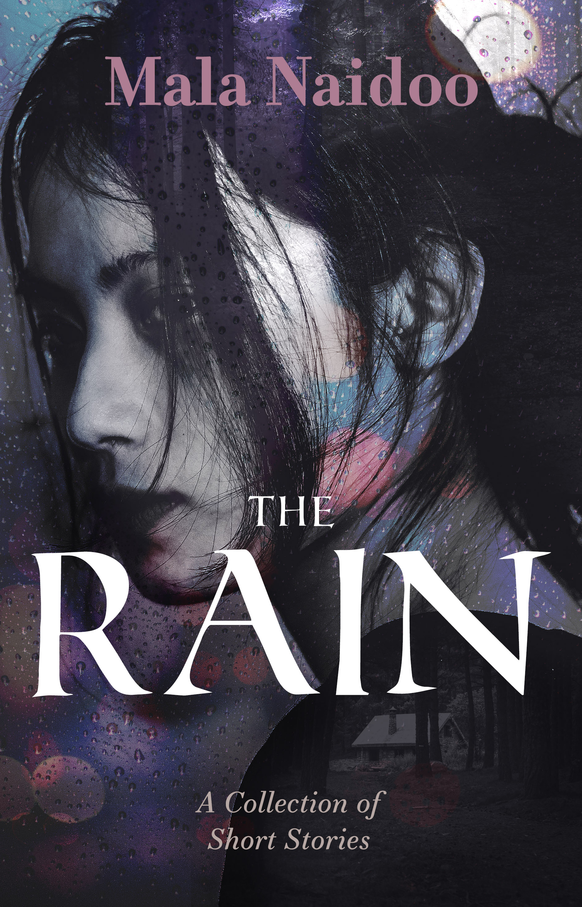
Mala Naidoo writes literary fiction — she prefers evocative, atmospheric cover images. For this collection of short stories. the composition we designed incorporated four images, including the barely visible hut in the woods (featured in one of her stories). The title typeface is Roman SD and the subtitle and author name use Essonnes.
Clients and You — A Practical Guide

A generously detailed look at running a creative practice and dealing with clients in a sane and fair way. Full of excellent tips on pricing, time management, project management, decision-making and the psychology of making a sale.
“Working with clients is hard, but—like any healthy relationship—it starts with a strong sense of self worth and confidence. Understand your value. That knowledge is power, so calculate it, know it, and communicate it. Protect your time. Screen potential clients. Set expectations for the relationship you want to have. Get comfortable with talking about money and the value you have to offer. Ask for it, then get it in writing. Rinse, repeat, and iterate.”
Epic Fiction and Domestic Dramas — Book Cover Design

Thomas and Rose spans the globe and many decades, while Memoirs of a Stay at Home Dad charts the efforts of one dad to raise his children and deal with the changing roles of men. The Thomas and Rose cover uses the sharply cut and elegant Orpheus Pro for the title, and the Stay at Home Dad sports the rough and warm finesse of Five Boroughs.

Rubber Brain — Cover Design

A bright and cheerful cover for a book showcasing techniques for increasing mental productivity and resilience, and targeting tertiary students. The rubbery title typeface is Hamurz and the subtitle is Gilbert.
“In this book, five leading psychological educators show you simple tools derived from a wide range of solid science covering everything from positive psychology to goal setting, from mindfulness to CBT, and from emotional regulation to moral reasoning, to optimise your thinking.”
Calling Creative Independents

Creatives often work in semi-isolation, even in the era of the Internet. The Creative Independent aims to provide an eclectic resource for artists and other creative people. Resources include interviews, practical advice for running a business, how to turn a creative idea into a career, avoid creative blockage etc. All clearly and unpretentiously written.
“The Creative Independent is a growing resource of emotional and practical guidance for creative people. Our goal is to educate, inspire, and grow the community of people who create or dream of creating. The Creative Independent is ad-free and published by Kickstarter, PBC.”
Virtual Box Set — Cover Design

Some of the conventions of print live on in digital books ... for example bundled sets of books are often depicted as an actual box set of the printed kind. We set up the pictured box set for Peter Ralph, the successful author of numerous financial thrillers.
“I’ve been involved in business and business litigation for most of my life and my story-telling is coloured by the days and weeks I’ve spent in lawyers’ offices, barristers’ chambers and courts waiting for the wheels of justice to grind to a conclusion. I enjoy slightly changing the facts, adding a little more violence than actually took place and changing the names of the characters to protect the guilty to produce what are hopefully enthralling business themed suspense novels.”
The Map is Not the Territory

National Geographic Magazine has just opened up an archive of thousands of its customised maps. Those of us who grew up with piles of yellow-edged National Geographic magazines will recall the intensely detailed and often very colourful maps covering the globe, nations and specific themes.

Australian Book Designers Association

There's an organisation for everything, even book designers. ABDA showcases the work of a group of designers with diverse approaches and workflows. It even organises awards, a few events and posts interviews with individual designers. Here's my interview from their archives.