


Anura Amarasena and Sisira Colombage have written a practical guide to trading with the rapidly expanding Asian economies, using Australia-Sri Lankan trade as a case study. We opted for a bold, colourful design with type conforming to the angles of the image. Typeface used: Proxima Sans.
How to Design Children's Non Fiction
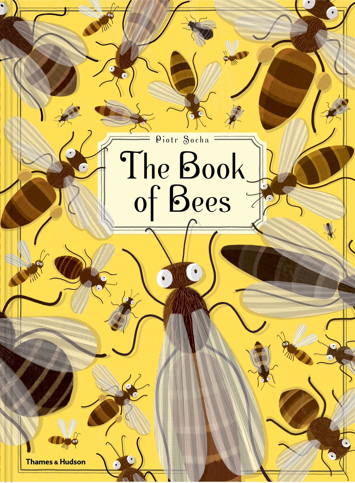
To get an idea of the quality of illustration in modern children's books, check out these two non-fiction titles: Tiny, by Nicola Davies and The Book of Bees by Piotr Socha. Both tackle big, complex topics and do so with humour, sophistication and amazing graphic impact. There has been an explosion of beautiful large format children's books in recent years, perhaps driven in part by parents keen to provide their children with an alternative to small glowing screens.
The Silver is Mine — WorkingType Cover
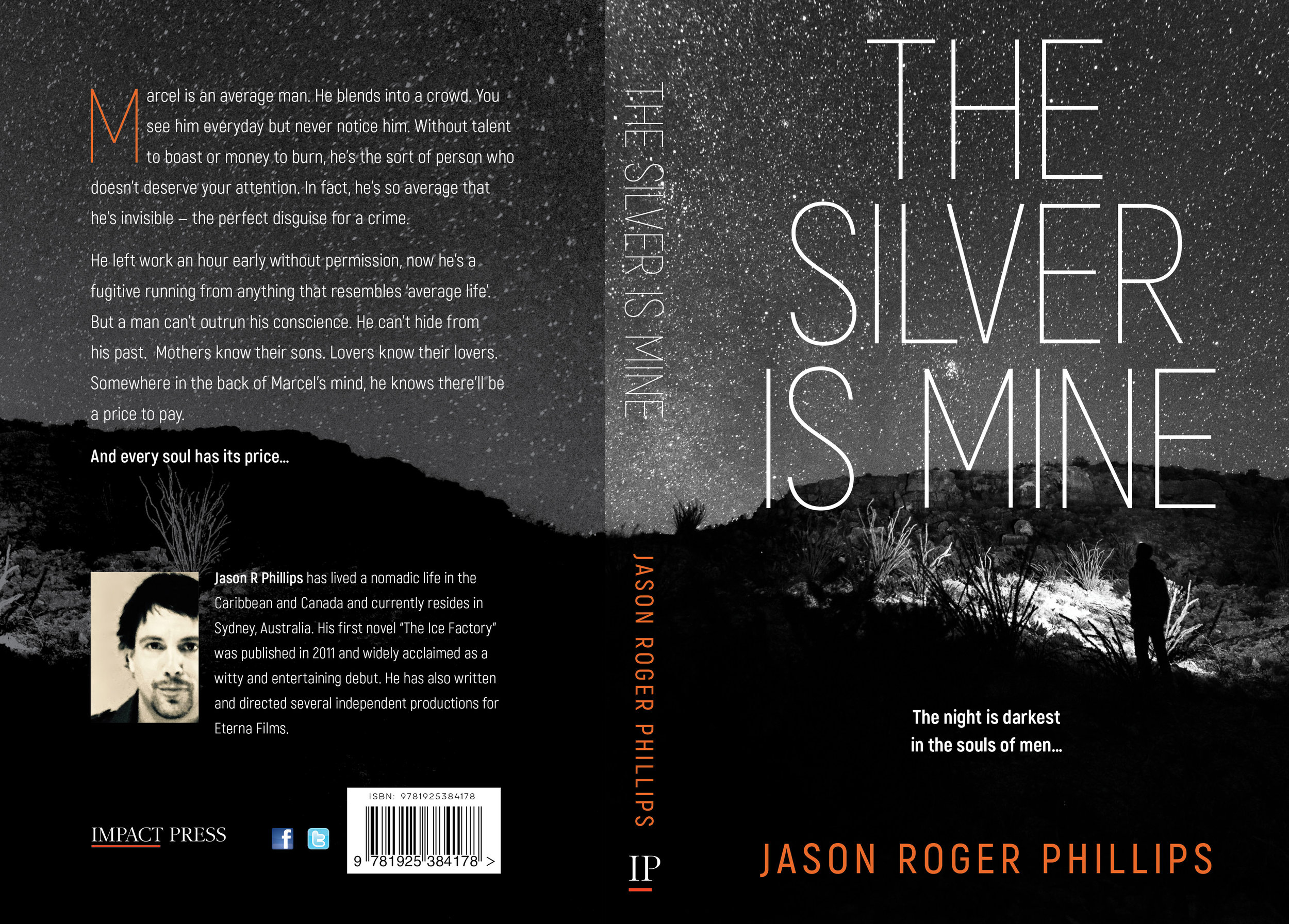
The Silver is Mine is an edgy psychological thriller published by Impact Press. Our client wanted a stark and high-contrast design. We used Akrobat Sans for the title type and a monochromatic starscape with enigmatic figure. The author's name provided the only splash of colour.
Culture Shock — Cover Design

An Egyptian man leaves his homeland for a better life in Europe, but must navigate his way through different cultural mores and expectations, and enter the minefield of a cross-cultural romance. Our cover blends the two worlds, with a muted colour scheme to match the era covered in the story.
Red Dragonfly — Cover Design
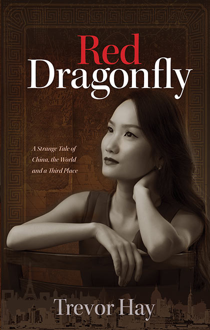
Combining several city skylines, a contemplative Chinese woman and Matteo Ricci's beautiful world map was an interesting challenge. Trevor Hay's book (in the process of being published by Arcadia, an imprint of Australian Scholarly Press) is a fascinating examination of cross-cultural contact and emotional connection.
Talking Her Way to Book Sales — Promotional Tips

Cleo Lynch, author of "Careering Into Corrections" has documented her own promotional activities in the hope that some of them might come in useful for other writers. Hear more about Cleo here and buy her book here.
Resources
- Publisher provided package of book covers
- Author biography
- Updated photo of author (perhaps holding the book)
- Updated list of previous talks
- Business card
- Pamphlets (rudimentary, as befits the technologically and financially challenged or more professional)
How did I start this ball rolling?
- Friends, rellies: Cousin worked for charity — gave talk for their IWD luncheon; some coverage in their local press. Sold some books (book sales are never staggering – just a steady trickle).
- Contacted Service Clubs and Social Clubs via email addresses and websites along with promotional material outlets — Senior publications (my age group), radio stations, newspapers (need to be innovative with covering letter — try to think of a catchy opening sentence). Did get one radio interview with Radio National). Not sure what book sales resulted from these initiatives.
- Sent promotional material to libraries – this has had very limited response, but am a friend of my local library, which resulted in an author presentation for which they did the promotional work, with leaflets, posters, on-line bookings etc. (From this I was asked to do two more talks, one at the Friends’ AGM on my volunteer work, and another at a local writers’ group on the pitfalls of publication).
- Always carry a package of book cover with business card and promo pamphlet inserted, and a copy of book. Learnt from experience that sales can result in the most unlikely places, e.g. conversations on a bus, functions etc.
In any event, the most successful of these initiatives has been from service clubs.
Advantages:
- Rewards and outcomes vary, e.g some expect the talk to be free and may offer wine, chocolates, free lunch/dinner, however many pay varying amounts for travel expenses and your time.
- If they enjoyed the talk, they tell others.
- Usually sell a trickle of books
- Opportunity to distribute promotional packages to interested persons and so tap into potential future engagements
However, as much of my modest fame depends on my interaction with the audience I ensure that my delivery is as professional as possible. So I offer the following:
- Prepare your talk, i.e. compose it, type it out, go over it, rehearse it.
- Ensure that your talk will not go over the allotted time (many of these clubs have gratis use of community rooms and have to vacate by a certain time),
- Ask for a microphone (and any other technology you might require), lectern for your prepared talk and small table on which to display your book (I take a plate stand) and promo material.
- Don’t read your talk – but keep it handy for reference
- Be aware of your target audience, i.e. if elderly, many will be hearing impaired, many will be inclined to nod off, (yes even mid-morning!), may have posture problems that compromise their comfort (One compliment I often receive is ‘I looked around the room and no one was nodding off!)
- Introduce yourself, thank people for attending, give brief overview of your book, why you wrote it etc. and if possible, try a little humour (e.g. I say ‘I wrote this memoir originally for my children and grandchildren, who I might say, are completely underwhelmed by it’).
- Speak slowly, use microphone, engage all audience (while some speakers recommend you focus on one spot, it is good to try to sweep your gaze around the room to try to engage as many as possible).
- By all means include readings from your book in your presentation, but I’ve found it more useful to limit fumbling for pages, by identifying one passage to read from the book, and then to include others in my typed out presentation, and introduce such passages as excerpts from my book.
- If you use power point, don’t use it as a passive tool – you are the speaker, power point is an accessory. Some of the most boring talks I’ve attended have been when speakers spoke indistinctly, leaving power point to do the work.
While compiling this, I received a phone call for another booking. I took details, i.e. date contact name, name of Club, email address of contact so I can forward promo material (or postal address). I gave my address for confirmation and details of talk. This takes my bookings up to August.
Local History, Eltham Style

Geoffrey A. Sandy has just published the third volume of his History of St Margaret's Church in Eltham, Victoria. Extremely comprehensive and well-researched, the history covers every possible aspect of that particular place of worship. The author has been a parishioner for several decades. Published by Busybird, who also published Volume 1 of this history (Volume 2 has yet to be published). Our design was in keeping with Volume 1, this time emphasising the interior spaces of the Church.
Re-starting an Important Social Debate
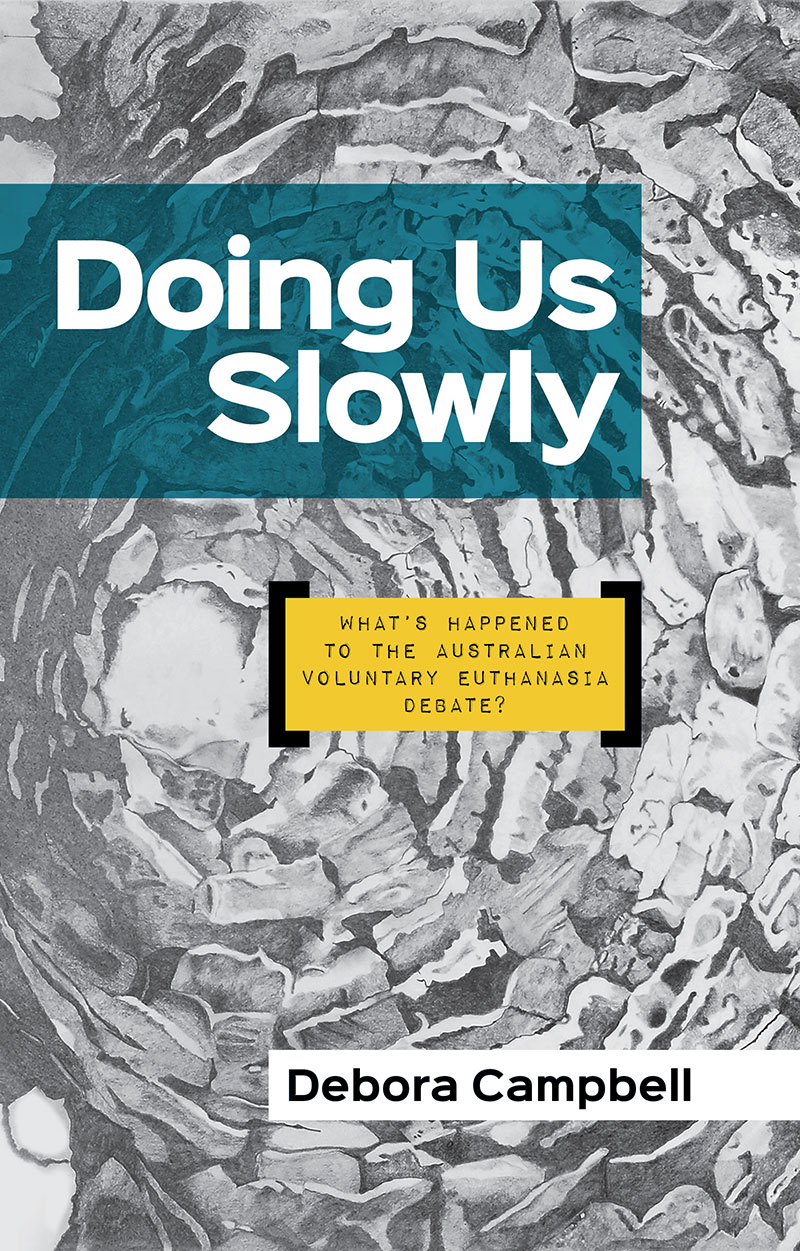
Deb Campbell is a passionate advocate for voluntary euthanasia. She believes that risk averse politicians have quietly kept the issue out of the public debate, despite broad public support for greater patient control over the end of one's life. We used a bold, highly visible sans typeface with a touch of personality for the title and author name (Sinkin Sans) and used Impact Label Reversed for the subtitle. The delicately shaded background artwork was supplied by the author.
A Tale of Two Professions

Joe Reich's latest book is an enjoyable journey through the vanished world of 1970s Melbourne — focusing on the intersecting lives of a doctor at a major urban hospital and an engineer working on the doomed first attempt to build the Westgate bridge. It is a masculine world of prejudice, misconceptions and cigarette smoke. This draft of the cover features an inverted image of the bridge in its incomplete stage and a troubled Melbourne sky.
In Praise of Book Launches — An Account

Natalie, Charlie, Diane and The Ghost Warrior who was the inspiration for the story
Author Natalie Gretton recovered from the recent bankruptcy of her publisher by holding a very successful book launch. Here is her account of the event:
My young adult medieval adventure novel was due for release five weeks after the publisher went into liquidation. After negotiation with the printers, I purchased the 1500 copies of The Healer of Marchmont. Neither my husband Mike of I had much idea of how to market the book to sell so listened to anyone who had advice for us.
I was offered our local Neighbourhood Centre to have a book launch and chose a date some weeks from that. Flyers went out to the whole town and outlying areas of Trentham through the postal service advertising the launch using the cover of the book, part of the blurb and a little about me. I also placed books in the local Trentham bookstore, Aesop’s Attic in Kyneton, New Leaves bookshop in Woodend, Stoneman’s Bookroom in Castlemaine and Paradise Books in Daylesford. These are on a commission basis. Friends were contacted by email, on Facebook, through my new website set up by my IT guru son, and word of mouth. A visit by friends who live in Canberra was good, because they took a box of 64 books back with them to sell for me. At present there are 5 books in Harry Hartog book shop in Woden, Canberra and more are being advertised by the friends. Other people took 10 books and sold those as well.
The book launch went very well. The day was lovely, sunny, still and warm. People came from many different places and were old and new friends we have known for short times and long times. We had some local people attend as well. Fifty people were here altogether. Some people had bought the book earlier and came to give comments about it or to get it signed for their children and grandchildren. Diane Parsons, a local retired secondary school teacher launched the book for me and after that, a critique was given by Charlie Wells. Charlie’s mother is the manager at the Trentham Neighbourhood Centre and had asked Charlie to read the book. His comments were very interesting and insightful for a ten year old young man. All the comments we had on the day and in emails since have been very positive. The day of the launch we sold $500 worth of books which did not include more that were sold prior to the launch.
There are still very many books to sell but at least I have more than some other writers who were left in the lurch. I think I was more fortunate than some other writers as I now have my book in print. Others were left with nothing to show for all their hard work and will now have to negotiate with another publisher.
So with a bit of advice and some energetic emailing, phoning, flyer producing and a launch with a good afternoon, good friends, some lovely snacks and a few drinks, one can recover from what could have been a total disaster.
I must say here that Julie Athanasiou, my editor and Luke Harris, my designer, have been most helpful. Luke has been in contact regularly and is most supportive of everything I have done. Thank you, Luke.
Natalie's website can be found here.
Re-covering the Classics

Cover art by Roberlan Borges
What could be more interesting for a book designer than tackling the cover design for some of the great works of world literature? The Recovering the Classics project aims to create exciting cover art for great works in the public domain.
“Sadly, many of the greatest classics in the public domain are left with poorly designed or auto-generated covers that fail to capture what makes these books exciting and inspiring to us. So we invited illustrators, typographers, and designers of all stripes to create new covers for 100 of the greatest works in the public domain.”
And some of the resultant covers very much fulfill that creative brief. Could this be the spur for you to read that masterpiece you've always been meaning to get around to?
Variations on a Theme — New Book Cover

A few iterations on a two book series (non-fiction) for a local author. At the time of posting, covers 1 and 2 are favoured, though further modifications are likely. As ever, selecting, manipulating, kerning etc. type is more than half the fun. Typefaces used include Trajan Sans, Trade Gothic, Alternate Gothic, Museo and Plume.
My Little Red Corvette — Cover Design

Our client wanted a stark, almost monochromatic cover featuring a vintage red corvette, and an assault-rifle wielding protagonist, all in the gritty shadow of a celebrity obsessed LA. Plus blood. There will always be blood. Typeset in Veneer italic and Magneto bold.
Guns, Money and the CIA — Book Cover Design

Some banks do more than rip off consumers. The bank covered in this story, for example, delved into drugs, gun-running and financial shenanigans. This soon-to-be-released book lifts the lid on a decades-old murder mystery. Building on a cover design initiated by the author, we aimed for a slightly sinister look and high impact type. Typefaces used are League Gothic and Veneer.
Early Sydney Examined — Book Cover

Our client had access to many interesting artworks from colonial Sydney. The chosen image shows Sydney Cove in a very early stage of development, more a village than a town. The typography is simple and in keeping with typefaces in use at the time.
Accidental Terrorist — Book Cover

A hapless conman inadvertently attracts the attention of American anti-terror operatives. Niresh Parag follows in the tradition of Tom Sharpe in chronicling Mukeri's misadventures, building up to a literally explosive finale. Our cover incorporates some of the key elements of the story, including a rocket made of 44 gallon drums! Typefaces used: Veneer, Ambulance Shotgun Pro.
Cut to the Chase — Book Cover Design

Writer of mystery and crime fiction, Ray Scott has an impressive website showcasing his work. Unusually, his news page is up to date, with accounts of recent talks and pointers to upcoming events. Cut to the Chase (cover design by WorkingType Design) is available on Amazon.
Genetics, Murder and Time Travelling — Recent Cover Designs

Three recent titles we have worked on. A diverse range of subject matter (as usual) — genetics, a Victorian-era murder mystery and a time travelling thriller.
High Caffeine Book Cover

Ilinda Brunner's "Coffee Lovers" is a lyrical book about memory, freedom and of course, coffee. We wanted the cover to capture the playful, often whimsical tone of the novel. Elements of the story peek out through the painterly lettering.
Stories From the Wild Side of Strata Title — Book Cover
Those who manage multi-residence properties encounter many strange and challenging residents. Stephen Raff has assembled the stories of a few of his personal favourites. From pig raising in flats to crocodiles in pools, Strata Living Stories features entertaining colour illustrations and some head-scratching behaviour. We embraced the comic strip character of the illustrations for the cover and gave it a lurid, tabloid feel to match the weirdness of much of the behaviour showcased therein.
