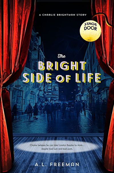
Annette Freeman's latest book is now available on Kindle. The Bright Side of Life depicts the picaresque adventures of Australian actor Charlie Brightman on the London stage. Our cover design melded street and stage to draw in the potential reader. Typeset in Trend Sans and Le Havre.
Trends in Logo Design and Iconography
Logo obsessive Bill Gardiner spends a lot of time time thinking about icons, symbols and logos. He has distilled that thought into a very long post on the state of this particular art, reflecting particularly on the growing ascendancy of mobile viewing platforms.
“So as we toil to conform to these new parameters, designers are developing a new set of iconography, and the adolescents, children, even infants of today are experiencing a very different visual dynamic than generations before them.”
Gardiner believes that icons and image based languages will become an important element of communication, perhaps displacing written language to some extent.
Perhaps the most enjoyable part of his post is the breakdown of logo design trends into categories such as: dot-tips, contours, sparkles, pick-up sticks, colouring, circle breaks and so on. Designers tend to move in packs, and even if they strive for originality, can't fight the gravitational pull of influence.
Project Naptha Finds Text in Images
This interesting Chrome browser extension attempts to liberate text in images on websites. It can "highlight as well as copy and paste and even edit and translate the text formerly trapped within an image". Modern web designers tend to leave as much text "live" (and therefore available for search indexing) as possible, but in all other cases, Project Naptha might save users from having to retype text. It has robust handwriting recognition and is also good at character recognition against busy backgrounds.
First Aid for Parents — Book Cover
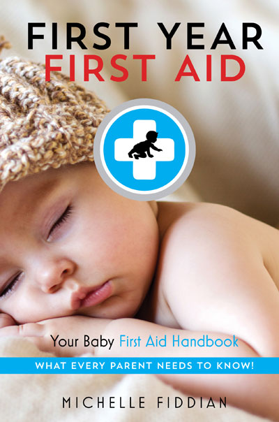
Keeping small children safe is a full-time occupation for parents. The ability of a toddler to get into trouble involving sharp objects, flights of stairs, hot water, bookshelves, food, animals and so on is genuinely amazing. Michelle Fiddian has written a very helpful introductory guide outlining both strategies for protecting little ones and acting quickly if accidents do occur. Published by Jo Jo Publishing. We wanted to show the vulnerability of the very young, using crisp, clean type. Title set in Trend Sans, subtitle in Mostra Nuova.
Reinvention and Redemption — Cover Design
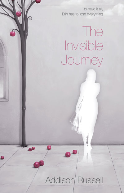
Our client wished to depict the journey of a woman forced to shed all that was familiar and comforting in order to be true to herself. We chose a surreal scene implying temptation and impermanence, with a muted colour palette.
Hooked on Hookturn
Using a term unique to Melbourne, Australia (a kind of turn necessitated by Melbourne's on-road tram network) Hookturnshowcases Australian made podcasts about culture and design. In a world dominated by the Brooklyn hipster aesthetic it feels good to experience something a bit more home-grown. As the site founders say: "Hookturn is made in Melbourne by people who care. That's probably all you need to know."
Practical and Tasty Food — Cover Design
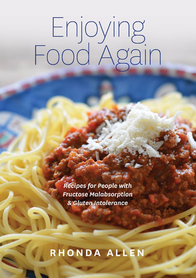
Diagnosed with fructose malabsorbtion and forced to avoid foods such as onion, garlic and wheat, Rhonda Allen had to discover for herself a new path to tasty, satisfying food. The eventual result was a collection of easy-to-prepare recipes which she assembled, then commissioned a photographer and engaged our services to design the cover and lay out the content.Enjoying Food Again is available at Rhonda's website and will be a welcome resource for those living with this condition.
This is Colossal
This is Colossal is a rolling survey of new art and design. Curating the site must be a huge labour. The works featured are consistently striking and often involve great feats of imagination and manual skill. Well worth a look, particularly for creatives needing inspiration.
Preparing Your Manuscrript for ebook Conversion
A note regarding the preparation of your book manuscript for ebook conversion, from our preferred ebook converter, Warren Broom:
What can be done in the ePub format:
Firstly, to convert to the epub format, we require a print ready PDF. This must be single page single column. If not, all of the sentences that form each column end up shuffled like a deck of cards. We will also need an ISBN and a description and subject to place into the meta-data that shows up on the retail site. Descriptions should be kept to 2 to 3 paragraphs.
Images:
We prefer to take the images from the pdf as many have captions that we include in the image so that they do not get separated from the image. We do all images in colour for those reading devices that support colour but, of course, they will render in greyscale in those that don’t.
Tables:
We can only do tables that are two cells wide as any more and the words start to get squashed up at higher zoom levels. Tables with more than 2 columns are done as images. Sometimes when table cross “pages, some of the text can separate but this is not usually a problem.
Hyphens:
If the text is justified, some words break in two, utilising a hyphen. Once again, this is not really a problem but, if the author wants to avoid them, we can align the text to the left.
Table of contents:
eBook reading devices produce a digital TOC but we usually add hyperlinks to the TOC in the ePub for earlier reading devices that don’t. We can also link sub heading to the TOC but they are not really necessary.
Indexes:
Redundant in ePubs as all reading devises have a search function. However, if the author really wants to include an index, it should only include single word references as multiple words will link to all references in each of each word included within the entry.
Footnotes:
We place all of the footnotes at the end of the chapter and can link the reference within the text to its’ corresponding footnote. I can also add a return link back to the text the reference is in. It should be noted that footnotes are very time-consuming and can dramatically increase the price of the ePub.
Fonts:
Fonts can be embedded but, many reading devices have a default font that overrides the embedded fonts. A maximum of 2 fonts can be embedded. It is also possible to add audio and video to an ePub but, this is very complex and dramatically increases the file size and also, the cost. Our recommendation is that that a hyperlink to an external website be employed to view or listen to these forms of content.
Hope and Change — Cover Design
Our client's book dealt with her long and ultimately successful struggle with an eating disorder, and she wanted the cover design to reflect a sense of optimism and potential change. We used a contemplative photograph and a fairly quiet type arrangement, with colours pulled from the underlying image. The author commented that "the great cover that you designed for my memoir ebook version receives lots of praise. The image you have created portrays the essence of looking ahead, remaining hopeful, and visualising new horizons. Also, I greatly appreciate your creativity in incorporating a picture of my favourite walking place, on the Bellarine Peninsula, into the cover design. Best wishes, June."
See also the author's website here.
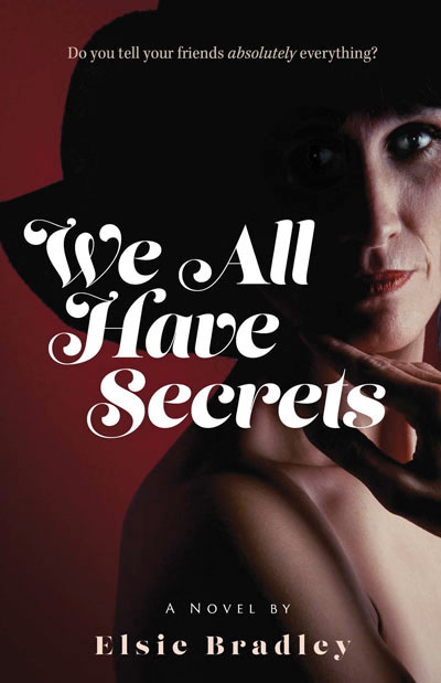
Uncovered Secrets — Cover Design
Our client wanted to hint at the intimate nature of the secrets shared by a group of women without the cover design being too overt or crass. Title set in the beautiful Lust Script, available as part of the Adobe Creative Cloud subscription.
Low Cost Standing Desks
Spooked by recent reports about the dangers of sitting all day, but not enthused about standing for such long periods of time? The Varidesk might offer a good compromise — the device sits on your existing desk and can be used to easily raise your monitor and keyboard to allow standing, then back down when your legs start to rebel. The Varidesk is relatively cheap and has an agent in Australia, which hopefully would keep shipping costs down.
Sunny Side Up — a new cover
A novel charting a friendship between a Greek migrant and a young, independently minded woman. We wanted to create a cover that depicted a spontaneous, unguarded moment, and perhaps hinted at deeper currents between the protagonists.
Fair Pay for Illustrators
Imagining a world where illustrators are paid fairly for their work, this page sets out suggested rates for various tasks and situations. In an increasingly borderless design world competing with much lower wage regions, those kind of rates may be difficult for many illustrators to achieve. The site hosting this page is a time portal back to the earliest days of eye-wateringly bad web design
Fate's Plaything
The middle aged protagonist loses his wife to a younger man, then falls in love with a woman who may or may not have his best interests at heart. Restrained typography and hints of Italy, venue for the novel's denouement.
The Mechanics of Ebook Selling
A succinct explanation of ebook selling at Jane Curry Publishing (now relaunched as Ventura), including the setting of prices and distribution of royalties.
Guide to Proper Use of Typographic Characters
A beautifully designed page designed to assist with the correct use of apostrophes, dashes, accents and other mistreated characters. Downloadable PDF version here.
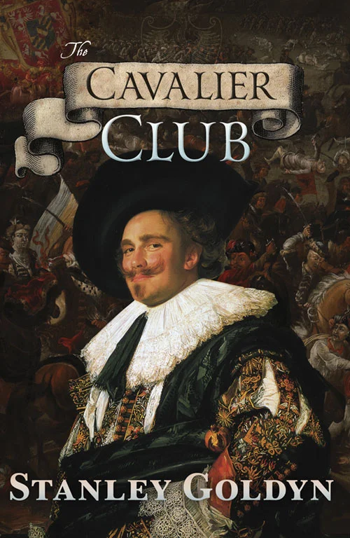
Swordplay and Swashbuckling
Stanley Goldyn takes an entertaining dive into the little-known world of the Thirty Years War, following his characters across the now-vanished Kingdoms of Central Europe. We blended battle scenes and a famous Cavalier and hopefully achieved a high impact result that hints at the key themes and tone of the book.
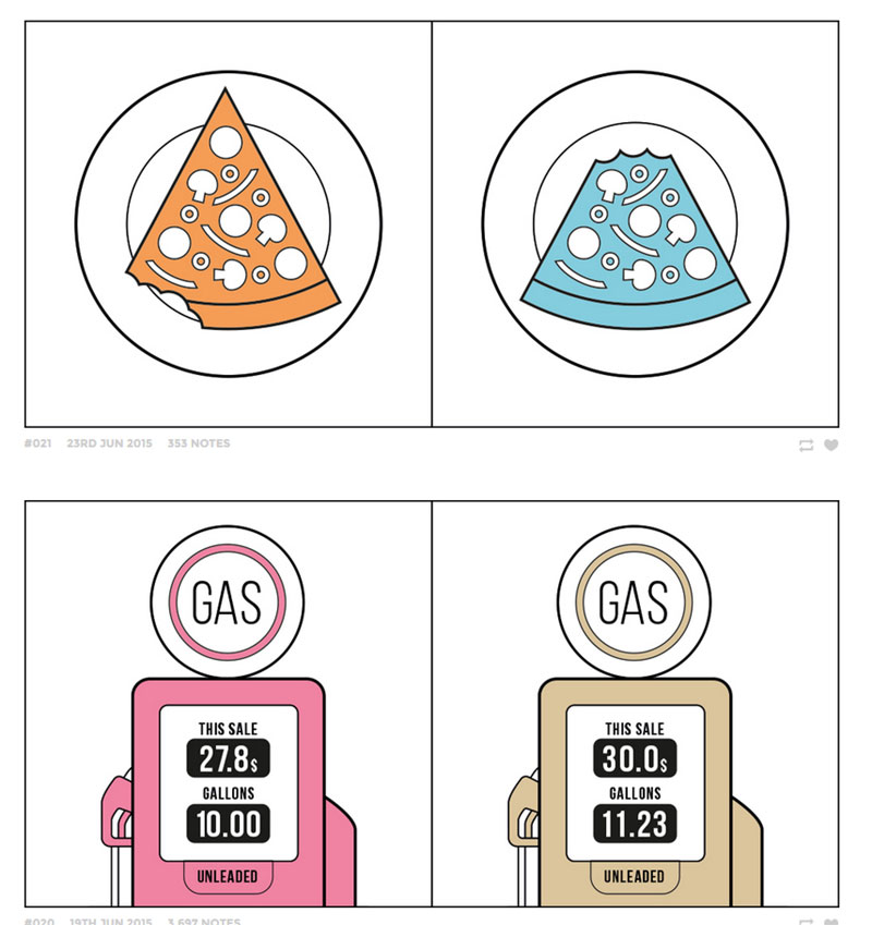
Two Kinds of People in Pictures
A cute, visually-oriented site exploring the subtle differences between people as expressed by their habits and technological preferences.
A Profile in Courage
John Jess was that rare Australian politician brave enough to stand up to his own party. He demanded justice for the seamen injured or killed in the collision of two RAN vessels — HMAS Voyager and HMAS Melbourne. We were lucky enough to be supplied with a sensitive pencil sketch of Jess, which we combined with two images of the tragic incident.


